Mike's Checks/claude-opus-5.5/09 pptx/compound engineering
09 pptx · compound engineering
claude-opus-5.5Claude Codehigh effortrun 20 Sep 20263,947,856 tokens
▸Instructions — what the model was asked
create a powerpoint in the every brand style on compound engineering, 30 min session https://every.to/guides/compound-engineering
A pptx skill is in skills/pptx/ — read skills/pptx/SKILL.md first. pptxgenjs is installed in the workspace, so require("pptxgenjs") works from here with no network. The brand guide is every-visual-style.md.
Answer
Checks
17/18Brand colorspalettethis task
share of rendered pixels on Every's documented palette, and whether the deck stays inside one theme (needs Pillow)
No AI-tell wordingai-wordingevery task
deliverable text contains none of the shared AI-tell phrases in bench/ai-tells.txt. Task checks may add narrower contractual bans, but must not repeat this shared floor.
inspected compound-engineering.pptx, ANSWER.md, every-visual-style.md, skills/pptx/SKILL.md, skills/pptx/LICENSE.txt, build/build-deck.js, build/preview.js, build/gen-assets.js
Deck opensopensthis task
a .pptx exists and parses (python-pptx when installed, stdlib zip+XML otherwise)
Slide countslide-countthis task
8-20 slides -- sane for a 30-minute session
No overlapping textno-overlapthis task
no two text-bearing shapes on a slide overlap materially (Mike's first question: "Is the writing overlapped?")
Slides renderrenderthis task
every slide rendered to a PNG in <output-dir>/_screenshots/ via LibreOffice (soffice --convert-to pdf) + pdftoppm. FAIL when required render tools are unavailable.
Q1Every's color palettethis task
Judge's reasoning
Consistent Theme 1 throughout: #121212 black grounds, Every Blue accents (slides 2, 8, 16), orange/green/purple/rust accents (7, 9, 11, 12, 17), and one Warm Cream slide 13 — no second theme, no corporate blue or gray.
▸Rubric
The palette is Every's. Theme 1 (Editorial): background Every Black `#121212` (or Warm Cream `#F5F2ED` for light slides), Every Blue `#C0F0FB` as the signature accent, white text, with `#FA7B20` / `#E9731E` / `#C4400F` / `#349361` / `#1324CB` / `#7301CC` as accents. Theme 2 (Consulting): background Teal Dark `#0F5258` with Teal Medium `#4999A0` for depth, Warm White `#FFFEFB` text, `#BB7B19` / `#F8DE6E` / `#2E8D23` accents. FAIL if the deck's colors are visibly not these — corporate blue, generic slide-template gray, purple-black AI dark mode, neon gradients — or if it flips between the two themes across slides. Close-but-different shades are fine; a different palette is not.
Q2Serif typographythis task
Judge's reasoning
All headlines and body are set in a Georgia-style serif (slides 1, 4, 9, 14, 16); sans-serif appears only on small labels like 'Part 1 · The problem' (3), the step pills (9-12) and the every.to footer.
▸Rubric
Typography is serif. The brand is serif-first: Signifier, or its documented PowerPoint substitutes Georgia and Times New Roman. Sans-serif (Switzer / DM Sans) is allowed only for small labels — session indicators, footers, captions. FAIL if headlines or body text are set in a sans-serif face (Arial, Helvetica, Calibri, Inter). "Sans-serif for main content" is on the brand guide's explicit avoid list.
Q3No banned decorationthis task
Judge's reasoning
No triangles/hexagons, diagonal slashes, corner brackets, drop shadows, double borders, stock photos, gradients or rotated text on any slide; the boxes on 2, 10 and 18 use single hairline rules and the blobs on 1, 4, 12, 17 are organic, not geometric.
▸Rubric
No forbidden decoration. The brand guide bans, in both themes: triangles, hexagons and other geometric accents; diagonal slashes and hard section dividers; corner brackets or L-shaped frames; drop shadows on boxes; heavy or double borders; stock photography; gradient backgrounds; rotated or outlined text. FAIL if any of these appears on any slide.
Q4Required design elementsthis task
Judge's reasoning
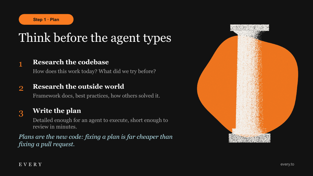
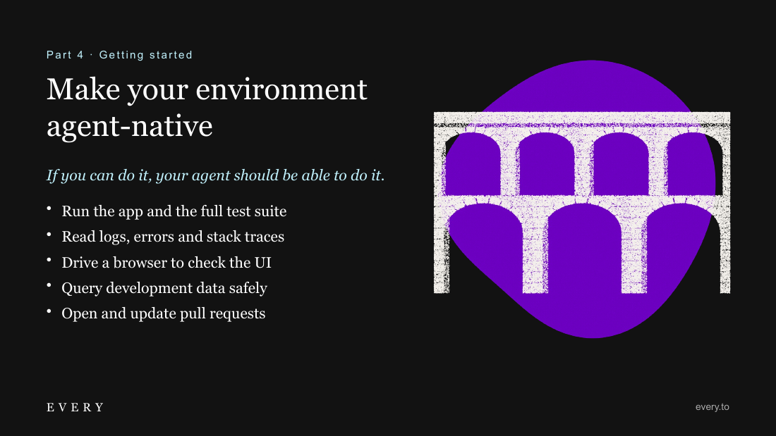
Edge-cropped brushstroke swooshes appear on slides 1, 2, 5, 6, 10, 13, 15, 18 and 19, and stippled classical illustrations (temple, nautilus, column, spheres, aqueduct) on 1, 4, 9, 12 and 17 — roughly two-thirds of the deck.
▸Rubric
The signature elements are there. Every decks carry organic brushstroke swooshes (the E / O / R SVG shapes, cropped at the slide edge, scaled large) and stippled classical illustrations — Greek and Roman architecture, figures, busts, sometimes with modern elements. The guide says to use the swooshes "liberally once every two or three slides." FAIL if the deck has neither swooshes nor classical illustration, or if such elements appear on fewer than roughly one slide in three. Mike's question on this eval: "does it use the, uh, SVGs?"
Q5Consistent footerthis task
Judge's reasoning
Every slide 1–19 carries the EVERY wordmark at lower left and 'every.to' at lower right, at identical position and weight, including the cream slide 13.
▸Rubric
The footer is consistent. Theme 1: EVERY logo left, `every.to` right. Theme 2: EVERY *Consulting* left, session indicator right. FAIL if content slides carry no footer, or if the footer appears on some and not others.
Q6Enough substancethis task
Judge's reasoning
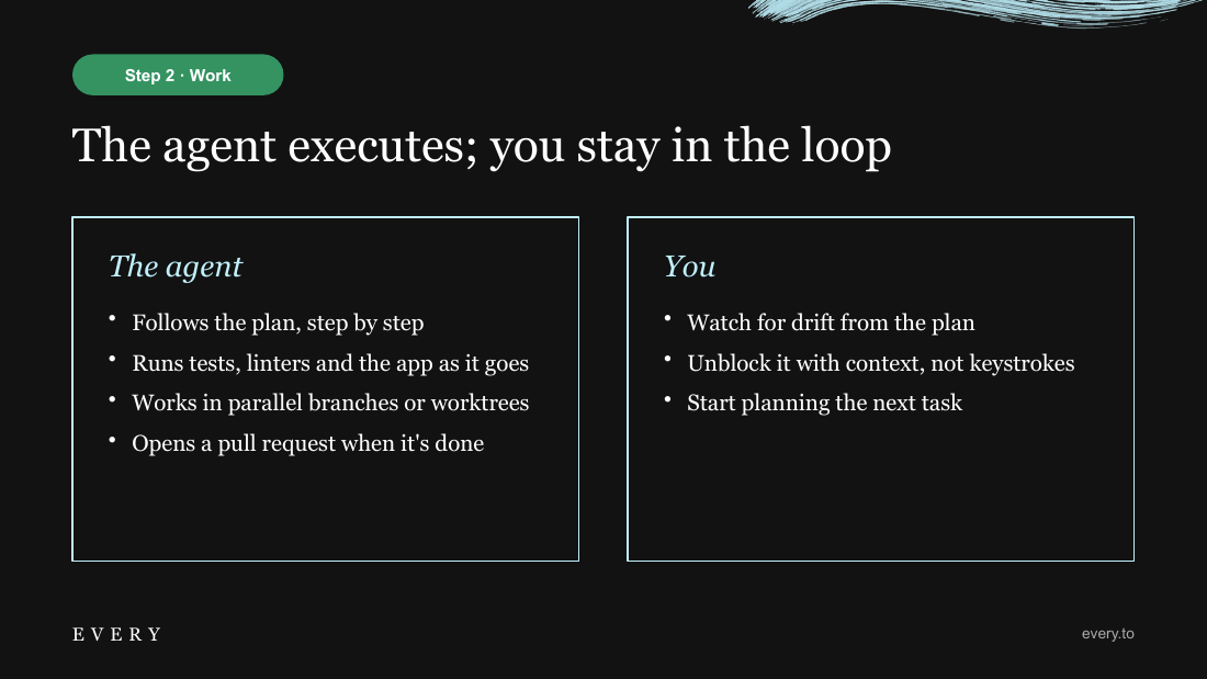
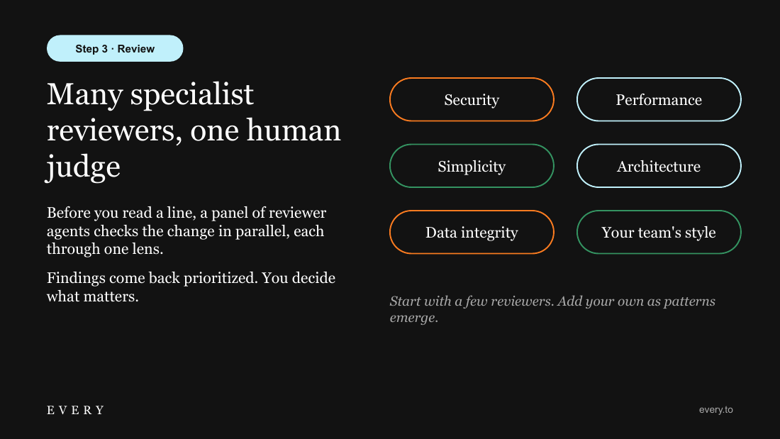
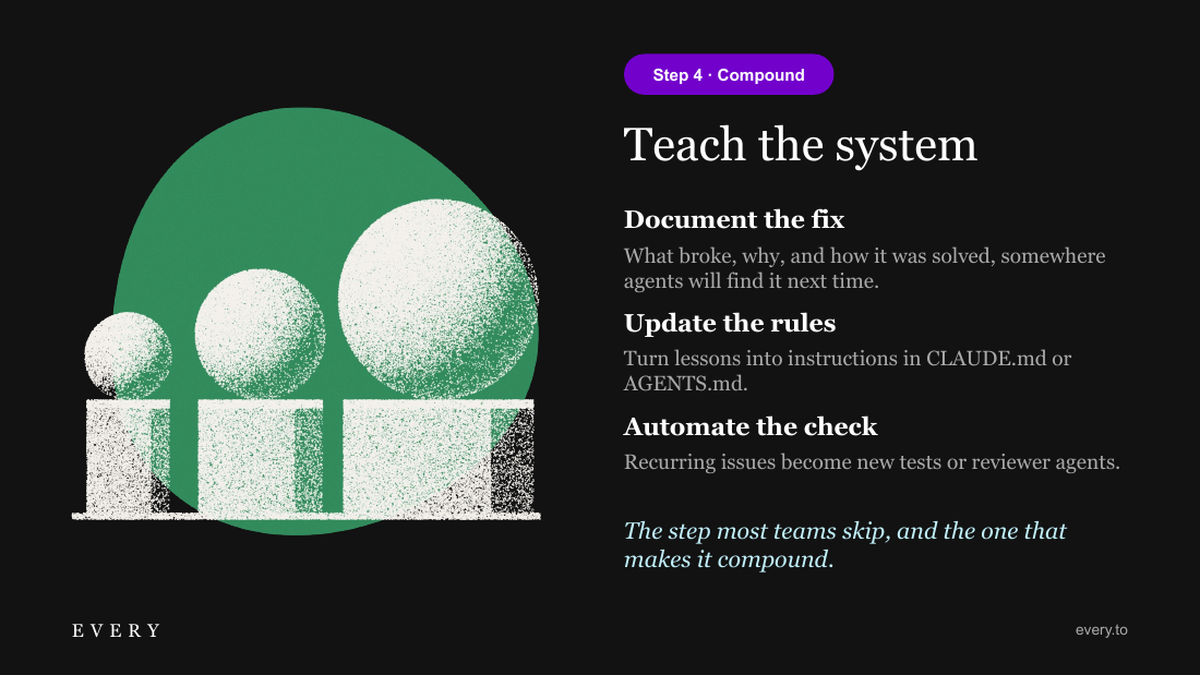
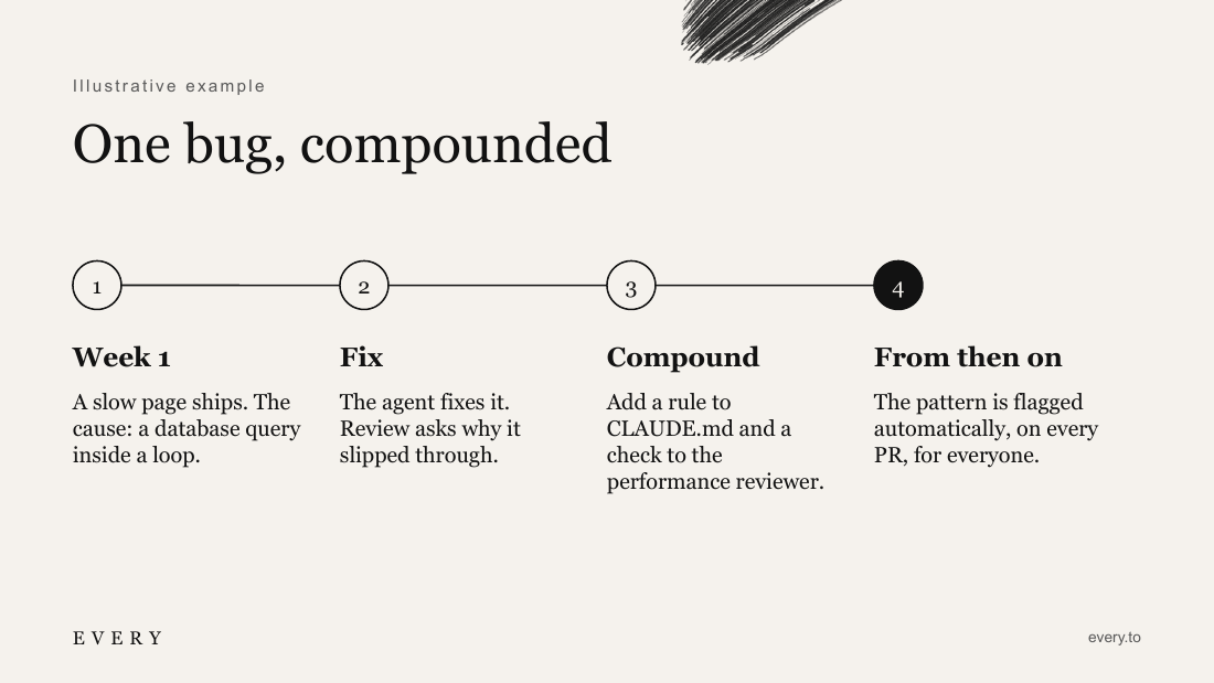
The deck carries real mechanism — the four-step loop with the 80/20 planning-and-review split (7, 8), plan-as-artifact research steps (9), parallel specialist reviewer lenses with a single human judge (11), and the compounding step of docs/CLAUDE.md rules/automated checks (12, 13) — not generic AI-coding advice; speculative items (the effort chart, the bug story) are explicitly labeled illustrative.
▸Rubric
The content has real depth. Mike: "the main failing of the decks generated by AI is still the content is quite shallow." PASS when the deck carries the load-bearing substance of the selected case's brief and source material: its important mechanisms, distinctions, evidence, and consequences. FAIL if the deck could have been written without reading those materials, reduces the subject to generic advice, or makes unsupported claims.
Q7Interesting materialthis task
Judge's reasoning
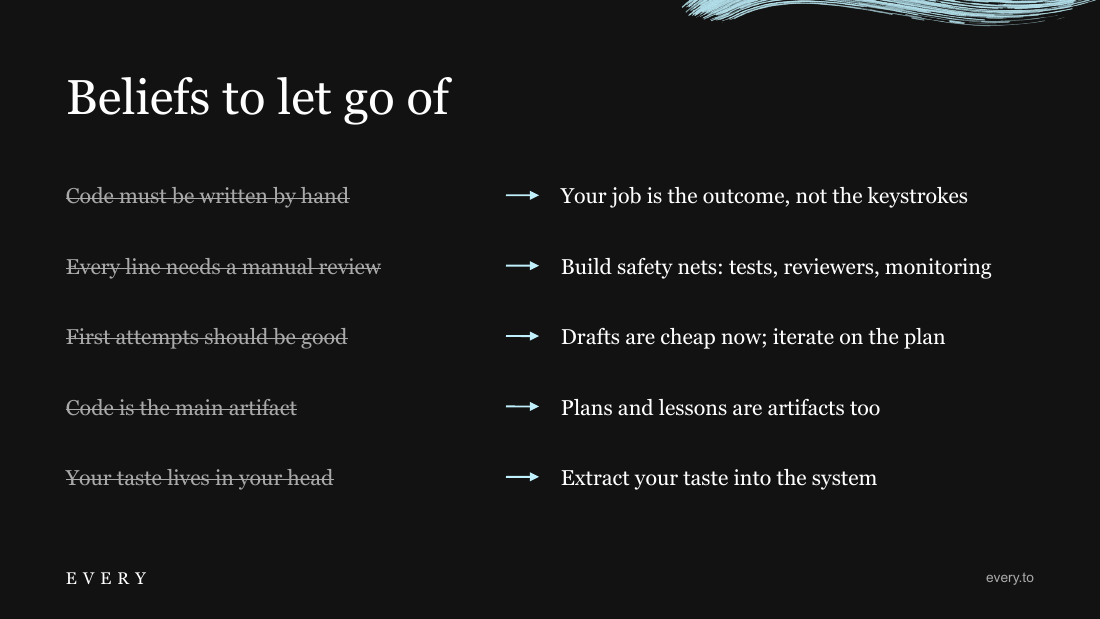
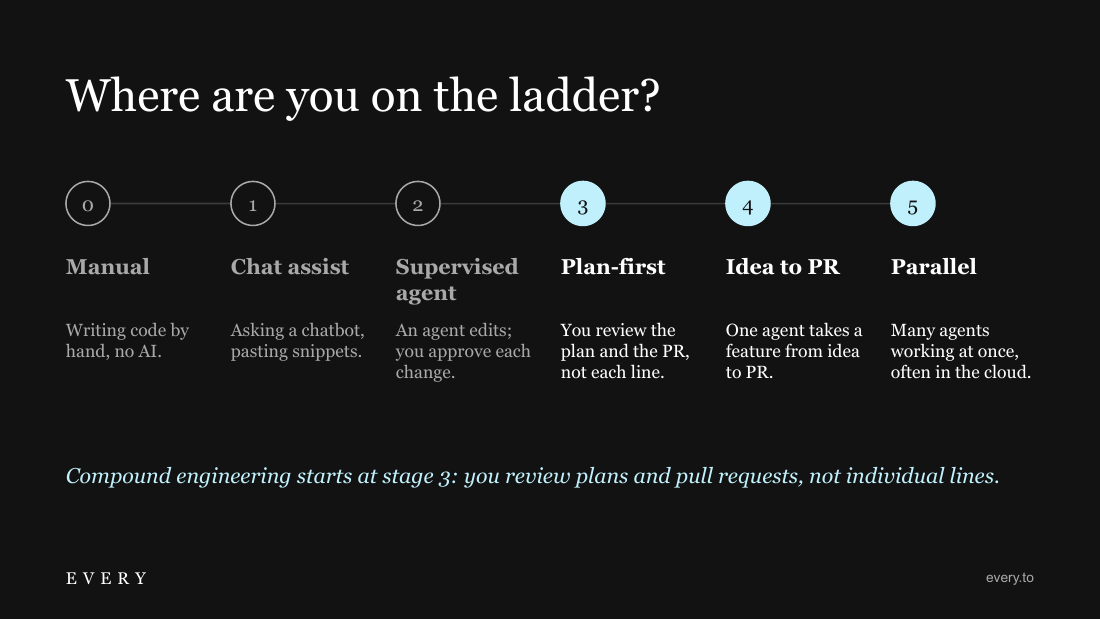
It argues a position rather than inventorying: 'plans are the new code' (9), 'the step most teams skip' (12), the belief-swap slide (15), and 'compound engineering starts at stage 3' on the adoption ladder (16), closing on a single actionable question (19).
▸Rubric
It picked interesting things to say. Mike's question on this eval: "does it pick out interesting things to write about." PASS when the deck makes a selective, coherent argument about what this audience should remember or do. FAIL if it merely inventories the supplied material in source order, restates headings, or includes facts without a point of view about why they matter.
Q8One idea per slidethis task
Judge's reasoning
Each slide holds one message with supporting detail — slide 8 is only the time split, 11 only the reviewer panel, 14 only the traditional/compound contrast, 16 only the ladder — and spacing stays generous with no slide crowded past readability.
▸Rubric
One idea per slide. Mike: it fails "if it tries to fit too many ideas on one slide." The brand guide says the same thing — "clear focal point: one main message per slide," "spacious, not cluttered." FAIL if any single slide carries more than one idea, or is packed so densely that a room could not read it while the presenter talks.
Q9Useful visualsthis task
Judge's reasoning
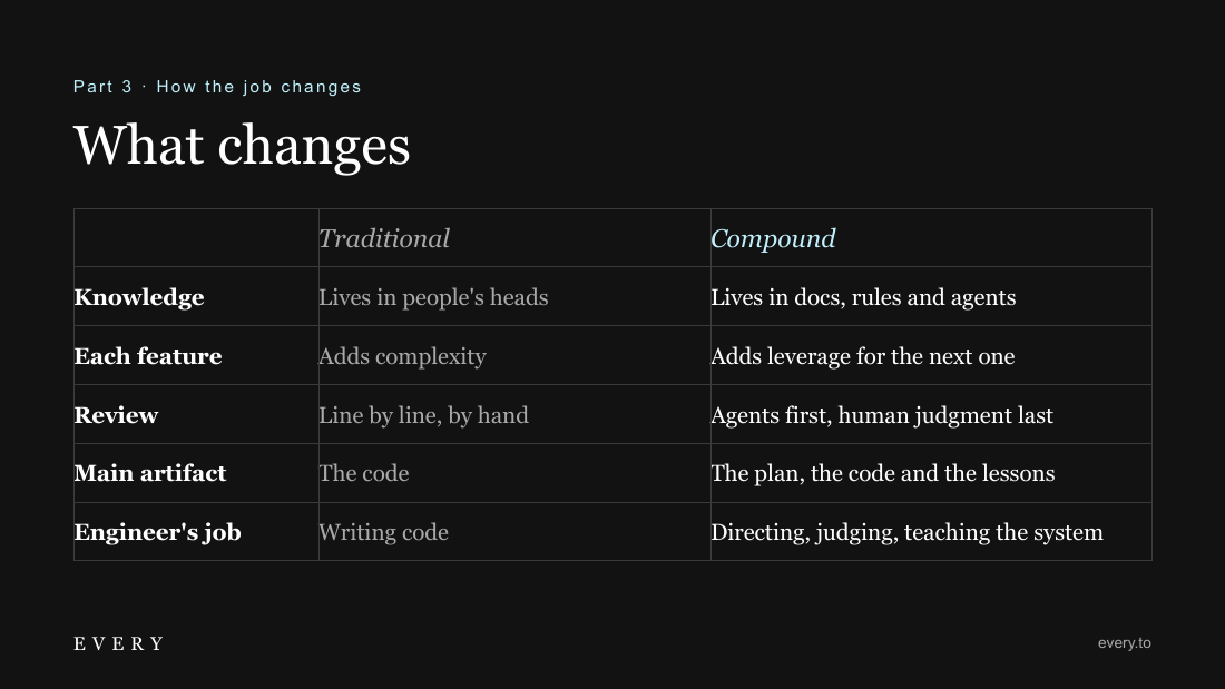
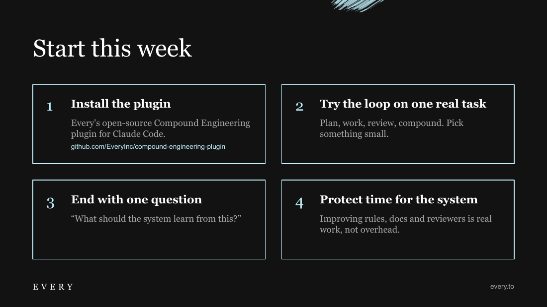
Most content slides are built visuals: the line chart (3), 50/50 quote-with-illustration (4), circular loop diagram (7), proportional bar and big-stat pair (8), pill grid (11), timeline (13), comparison table (14), struck-through belief swaps (15), stage ladder (16) and card grid (18); only 10 and 17 are title-plus-bullets.
▸Rubric
Real visual elements, not walls of bullets. Mike's question: "does it create good visual elements." Real means: a diagram of the loop, a staged progression, a 50/50 split with illustration, a quote in an organic blob, a comparison built from shapes — something that carries meaning visually. FAIL if the majority of content slides are a title plus a bulleted list.
Q10Readable slidesthis task
Judge's reasoning
No overflow, clipping or collision in any render — the plugin URL sits inside its card on 18, the multi-line stage label on 16 clears its description, and the swooshes on 6, 13 and 19 stay clear of the footer text; contrast is high on both the black and cream grounds.
▸Rubric
Every slide is legible as rendered. FAIL if any slide has text running off the edge, text clipped by its container, text over an image or shape at unreadable contrast, or headline and body colliding. (A separate script check already catches overlapping text boxes; this question covers what the geometry check cannot see — overflow, clipping and contrast in the actual render.)
Q11Does the deck carry the guide's load-bearing compound-engineering substance?this case
Judge's reasoning
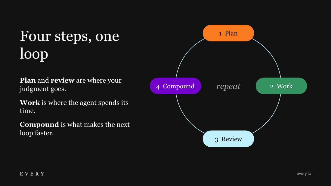
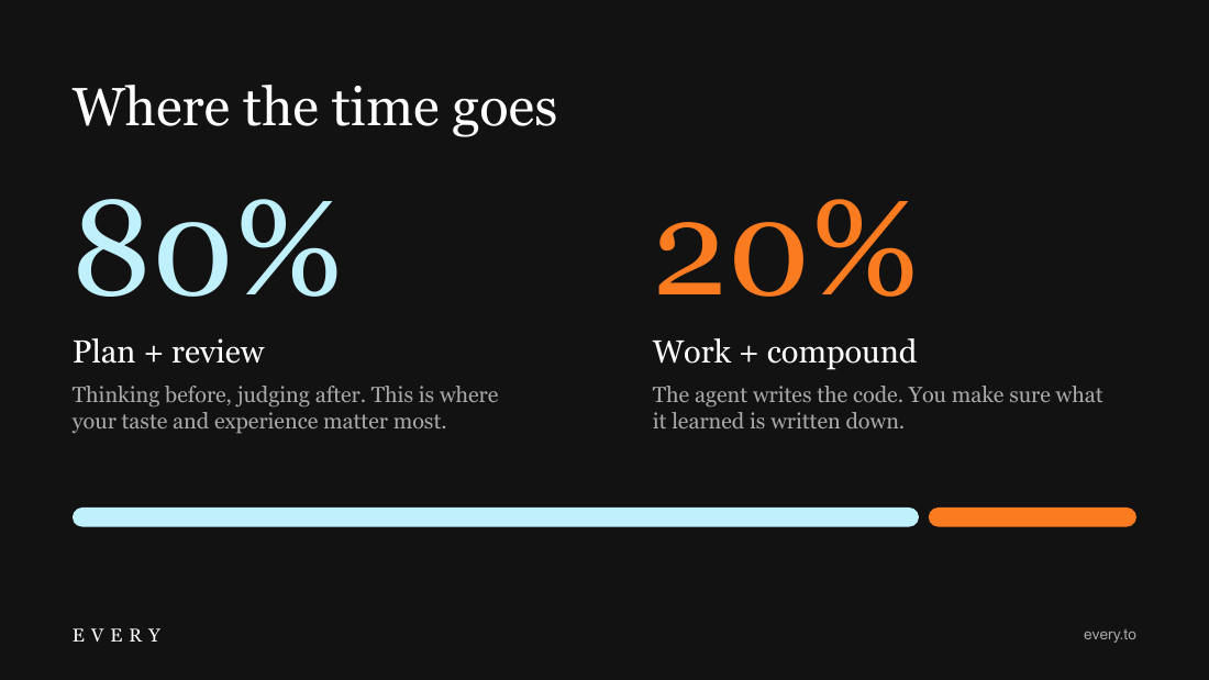
Slides 6–12 walk the plan→work→review→compound loop with slide 12 framing compound as the step most teams skip and naming concrete artifacts (CLAUDE.md/AGENTS.md, reusable reviewer agents, automated checks); slide 8 carries the 80/20 plan+review vs work+compound shift and slide 16 gives the staged adoption ladder 0–5.
▸Rubric
Does the deck carry the guide's load-bearing compound-engineering substance? PASS when it explains the plan → work → review → compound loop, makes the compound step the differentiator from ordinary AI-assisted work, and uses concrete artifacts such as CLAUDE.md, reusable agents, skills, or commands. It should also convey the guide's 80/20 shift and staged adoption path. FAIL when it substitutes generic AI productivity or prompting advice for those mechanics.
Q12Does the session make a deliberate choice about what matters most in the guide?this case
Judge's reasoning
The deck is time-budgeted around a thesis rather than a heading dump: 12 of 30 minutes on the loop (slides 6–13), plus argumentative slides 14 (traditional vs compound), 15 (beliefs to let go), 16 (where are you on the ladder), 18 (start this week) and the closing ask on 19, 'What will your system learn this week?'
▸Rubric
Does the session make a deliberate choice about what matters most in the guide? PASS when the 30-minute deck selects and connects the guide's most consequential ideas for the audience. FAIL when it is effectively a table of contents—one slide per source heading in source order, without a point of view about what the audience should retain or change.
Notes
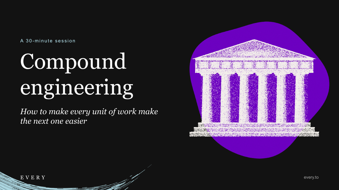
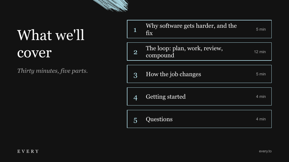
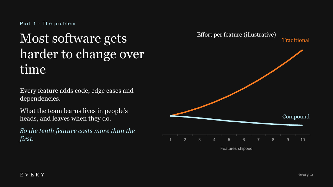
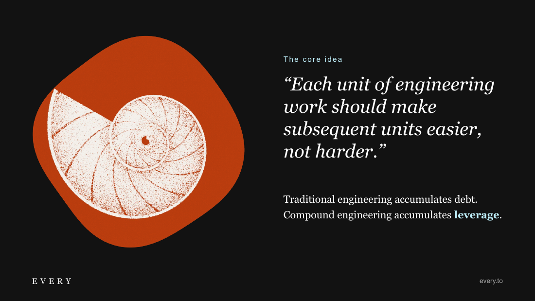
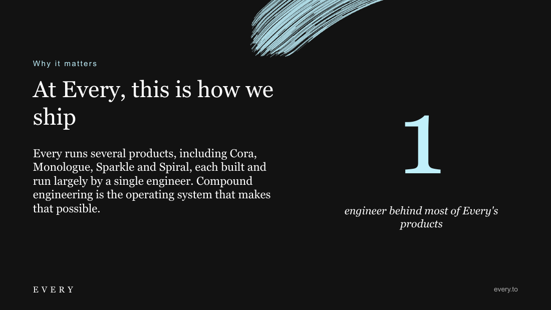
1Alright, the PowerPoint task. This is the one that everyone's excited about. The first picture is a bit weird. It made its own SVG, which is cool, and it looks like a cool design. But the SVG is kind of fuzzy, and I don't know if that's a specific design decision or not. It did a good job of visualizing the complexity of traditional software, which gets harder over time, versus compound engineering. It did make, yeah, I think the SVG was a design decision, but it just looks a bit weird. But I like that it actually tried to make design decisions, hallucinated a little bit, or pushed a little bit too hard. It says there's one engineer behind most of Every's products, and what it really should have said is that each product has its own engineer. So it's a bit of a bolder claim than reality. It got the circle right, but it's kind of lost the design a little bit, and it used the wrong logo. Yeah, it has drifted quite a bit from the Every design. It's kind of gone for dark mode instead of green, and with the fuzzy SVGs and stuff, it's also made its own kind of background things. And I didn't use the Every logo. I'd say this is okay, but I think the SVGs are better than what we had before. Has good spatial awareness, but it's not as good as other models. So yeah, not a bad attempt, but there have been better. I think Fables 5.1 did a better job.
21 Sep 2026