Mike's Checks/meta-muse-spark-1.3/01 dashboard
01 dashboard
meta-muse-spark-1.3OpenCodehigh effortrun 8 Sep 202691,501 tokens
▸Instructions — the case's current instructions; none were saved with this result
I want you to build a static html NPS dashboard and pick out interesting insights after doing analysis of the comments
Answer

Every NPS — Analysis & Insights
Deliverable: nps-dashboard.html (fully static, no external dependencies — open in any browser).
Source: nps_and_descriptions_only.csv. Assumption: each of the 195 rows is one independent respondent and the file is the complete sample.
Headline numbers
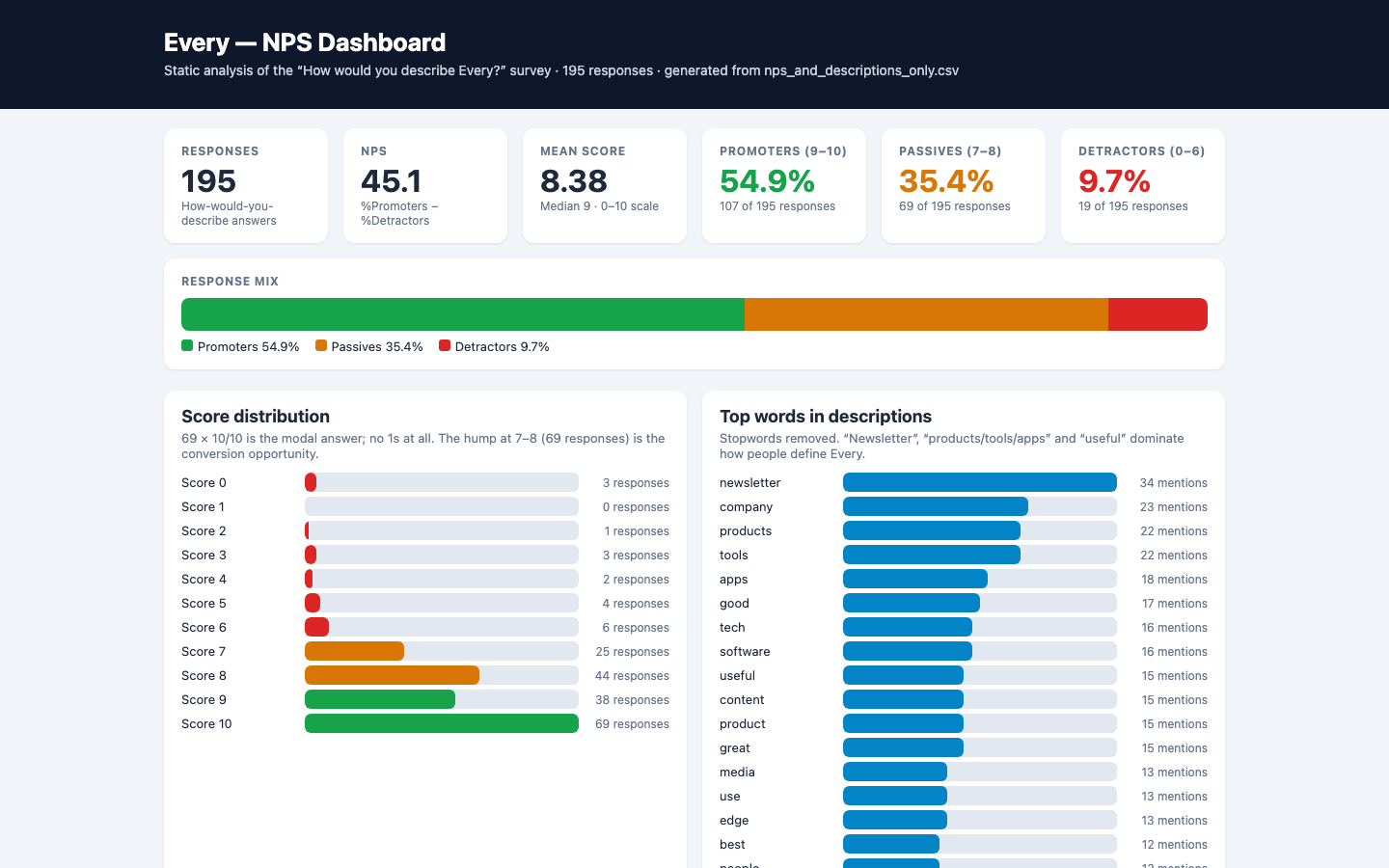
- n = 195, mean 8.38, median 9, mode 10 (69 responses, 35.4%).
- Promoters (9–10): 107 (54.9%) · Passives (7–8): 69 (35.4%) · Detractors (0–6): 19 (9.7%).
- NPS = 45.1 — generally excellent for a media/subscription business.
- Distribution is left-tailed: no 1s at all; only 7 scores ≤ 4. The bulk of non-promoters sits at 7–8, not in outright rejection.
How comments were coded
Keyword-coded per comment, multiple tags allowed (case-insensitive substring):
| Theme | Rule keywords | n | Avg score |
|---|---|---|---|
| Products / tools / bundle | product, app, tool, software, bundle | 97 | 8.23 |
| Media / newsletter | newsletter, media, magazine, publication, blog, editorial, journal | 62 | 8.45 |
| Learning / insight | insight, learn, think, smart, thought, philosoph, deep, educat, knowledge, guide, resource, playbook, mentor | 60 | 8.47 |
| Practical / useful | practical, useful, workflow, productiv, actionable, applied, usab | 27 | 8.81 |
| Studio / business model | studio, lab, incubat, collective, consult, business model | 23 | 8.48 |
| Frontier / innovation | cutting edge, frontier, bleed, future, pioneer, next gen, innov | 21 | 9.10 |
| Friction / value risk | confus, mac, security, price, expensive, money, fleece, cancel, too much, overwhelm, out of touch | 10 | 4.90 |
| Community / live learning | community, event, workshop, course, honest, humble, approachable | 10 | 9.40 |
Top raw words (stopwords removed): newsletter (34), company (23), products (22), tools (22), apps (18), tech (16), software (16), useful (15), content (15).
7 interesting insights
1. Strong brand, soft middle — the 8s are the growth lever
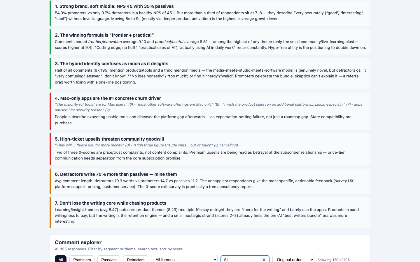
54.9% promoters vs 9.7% detractors is healthy, but 35.4% passives describe Every as merely "good / interesting / cool" without love-language. Converting 8s ("should be using the apps", "need to fully use") via product activation matters more than fixing detractors.
2. The winning formula is "frontier + practical"
Frontier language averages 9.10; practical/useful averages 8.81 — among the highest themes (only the small community/live-learning cluster is higher at 9.40). Recurring phrases: "actually using AI in daily work", "practical uses of AI", "cutting edge, no fluff". Hype-free utility is the positioning to double down on.
3. The hybrid identity delights and confuses in equal measure
Half of all comments (97/195) mention products/tools and a third mention media — the media-meets-studio-meets-software model is genuinely novel, but skeptics answer "I don't know" (6), "No idea honestly" (7), "too much" (0), "very confusing" (4), "nerdy"/"weird" (5–6). Promoters celebrate the bundle; skeptics can't explain it — a referral drag. Fix with a one-line positioning.
4. Mac-only apps are the #1 concrete churn driver
- "The majority [of tools] are for Mac users" (0) · "most other software offerings are Mac only" (8) · "I wish the suite ran on… Linux, especially" (7) · apps unused "for security reason" (2).
People subscribe expecting usable tools and discover the platform gap afterwards — an expectation-setting failure, not just a roadmap gap. State compatibility pre-purchase.
5. High-ticket upsells threaten community goodwill
Two of three 0-scores are price/trust complaints, not content complaints: "fleece you for more money" (0) and "High three figure Claude class… out of touch… I will… cancel my subscription" (0). Premium upsells read as betrayal of the subscriber relationship — separate price-tier communication from the core subscription promise.
6. Detractors write 70% more than passives — mine them
Avg comment length: detractors 19.3 words vs promoters 14.7 vs passives 11.2. The unhappiest respondents give the most specific feedback (survey UX — "the text box is so tiny", platform support, pricing, customer service). The 0-score exit survey is practically a free consultancy report.
7. Don't lose the writing core while chasing products
Learning/insight themes (avg 8.47) outscore product themes (8.23); multiple 10s say outright they are "there for the writing" and barely use the apps. Products expand willingness to pay, but writing is the retention engine. A small nostalgic strand (scores 2–3) already feels the pre-AI "best writers bundle" era was more interesting — don't orphan it.
Suggested next actions
- Add one-line positioning ("practical AI frontier: newsletter + tools") everywhere — test whether "don't know / too much" answers fall.
- State OS/security requirements before checkout; prioritize web/Windows/Linux or a compatibility page.
- Ring-fence premium upsell messaging from core subscription value.
- Run an activation campaign aimed at 7–8s who own but don't use the bundle (Lex/Monologue/Cora/Sparkle mentions are currently rare: 1/3/2/1).
- Fix survey UX (tiny textbox complaint) — ironic for a design-led brand.
Checks
8/9Page loadsrenders
the dashboard loads in a headless browser with no console error and paints at least 40 characters of text. Cannot pass without Playwright installed.
Correct NPSnps-correct
the page says "NPS" or "net promoter", and the NPS computed from the source CSV appears on it within 0.15. Missing source data fails closed.
Score breakdowndistribution-shown
"promoter", "passive" and "detractor" all appear, and all three groups carry either their raw count (within 0.01) or their share (within 0.2 of a percentage point). Missing source data fails closed.
Working controlsinteractive
driving a real control -- text/search input, select, button or tab -- changes what the page displays. FAIL when the page could not be driven at all.
Q1Useful headline
Judge's reasoning
The top-level headline is "Every — NPS Dashboard," a bare label that would sit unchanged on any NPS dashboard and says nothing about what this particular survey showed.
▸Rubric
The headline earns its place. Look at `fold.png` and read the dashboard's own top-level title/headline — the line the page leads with, not the browser tab title and not a section heading. This asks two things of one line, and FAILs if either is missing. It must (a) say what this particular data showed, and (b) be worth reading. FAIL if the headline is a bare label that would sit unchanged on any NPS dashboard for any product — "NPS Dashboard", "Every NPS Results", "Customer Feedback Analysis", "Survey Results Overview" — or if it is a naked metric restated as a title. FAIL also if it reaches for interest at the cost of accuracy: a claim the data on the page does not support. PASS if someone who read only that line would learn something true and specific about this survey, and would want to look at the rest. The reviewer's words: *"is the headline a good concise summary of the content while being interesting?"*
Q2Distinctive design
Judge's reasoning
Light slate-gray page with white cards, a dark navy header band, and green/amber/red semantic accents — a considered, conventional light treatment, not purple-on-black neon dark mode.
▸Rubric
AI-slop design. Look at `fold.png` and `full.png`. FAIL if the dashboard looks like generic AI-generated design — the reviewer's words: "we should definitely weigh it down if it's purple-black dark mode," and "at the very least, like it shouldn't look like a Vibe Slop, like purple dark mode." The specific tell is a purple-on-black dark-mode treatment (purple/violet/indigo gradients, glow, neon accents on a near-black background). PASS anything that reads as a considered design, light or dark, that isn't that.
Q3Readable typography
Judge's reasoning
Deliberate system-UI sans stack with clear hierarchy (32px KPI numerals, uppercase letterspaced labels, muted subcaptions), high contrast dark ink on light ground, and no cramped or clipped text.
▸Rubric
Typography. Look at `fold.png` and `full.png`. FAIL if the type is unconsidered or hard to read — the reviewer's words: "the typography. Like did it pick like good fonts? ... Is, is it like easy to read?" Concrete failure evidence: raw browser-default fonts, low-contrast text, cramped or overflowing/clipped text, sizes so small the numbers and comments are hard to read. PASS if fonts look deliberately chosen and the page is comfortable to read.
Q4Useful findings
Judge's reasoning
Insights go well beyond arithmetic — Mac-only platform gap as a concrete churn driver, high-ticket upsells reading as betrayal in the 0-scores, and the promoter/skeptic tension over Every's hybrid media-plus-software identity, all quoted from comments and actionable.
▸Rubric
Decision-useful insight. Read the insights section(s) of the dashboard. FAIL if every stated insight is arithmetic restated — counts, percentages, averages, or "X% are promoters" phrased as a finding — with nothing that would help someone decide. The bar, in the reviewer's words: "would this actually be useful for me if I was ... making a decision about whether Every is a good product or not." PASS if at least one insight names a pattern in the comments (a theme, a segment, a tension between what promoters and detractors say) that a reader could act on and that is not derivable from the score distribution alone.
Q5Key facts first
Judge's reasoning
fold.png shows the NPS 45.1 KPI alongside separate Promoters 54.9% / Passives 35.4% / Detractors 9.7% cards plus a stacked response-mix bar, all without scrolling.
▸Rubric
Key information above the fold. Look at `fold.png` only. FAIL if the headline NPS number and the promoter/passive/detractor breakdown are not both visible without scrolling. The reviewer's words: "does it, does it like put the important information above the fold? ... That's the main thing for me."