Mike's Checks/deepseek-v4-flash/01 dashboard
01 dashboard
deepseek-v4-flashCodex CLIhigh effortrun 4 Sep 2026172,585 tokens
▸Instructions — the case's current instructions; none were saved with this result
I want you to build a static html NPS dashboard and pick out interesting insights after doing analysis of the comments
Answer
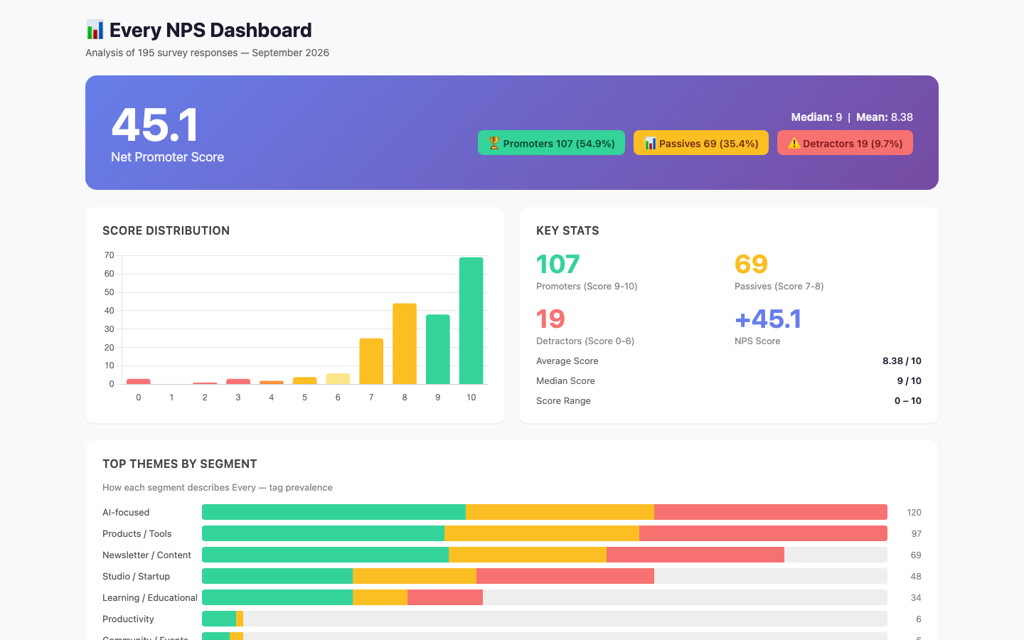
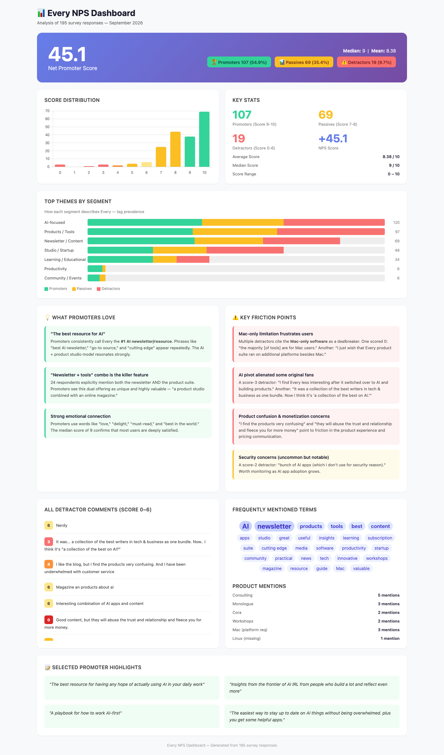
Every NPS Analysis: Insights & Recommendations
Overview
- NPS Score: 45.1 — a solid score, above the SaaS average of ~30–40, indicating strong user loyalty.
- 195 responses | Median: 9 / Mean: 8.38 | Promoters: 54.9%, Passives: 35.4%, Detractors: 9.7%
Key Insights
1. The "Newsletter + Tools" Bundle is the Core Value Proposition
24 respondents explicitly describe Every as a combination of a newsletter and a product suite. This dual identity is Every's strongest differentiator. Promoters consistently frame it as unique — "a product studio combined with an online magazine." No competitor was mentioned by name, suggesting Every occupies a differentiated niche.
Opportunity: Double down on marketing this combo. The phrase appears in 12% of all responses and is universally viewed as a strength.
2. AI-Focused Identity is Resonating — But Cost Some Early Fans
64% of promoters and 53% of all respondents mention AI. However, two detractors clearly miss the pre-AI era. One scored 3: "I find Every less interesting after it switched over to AI and building products." Another lamented the shift from broad tech/business writing to an AI-only focus.
Risk: The AI pivot traded breadth for depth. The 9.7% detractor rate is low but these voices suggest a niche of original subscribers may churn if Every becomes only about AI.
3. Mac-Only Software Is a Concrete Barrier
At least 3 respondents explicitly flagged Mac-only tools as a problem. One zero-scorer wrote a 100-word essay about subscribing only to find most tools don't run on their platform. A passive (score 7) said: "I just wish that Every product suite ran on additional platforms besides Mac — Linux, especially."
Impact: This is a tractable complaint. Expanding to web-based or cross-platform delivery could convert detractors and unlock new segments.
4. Product Experience Has Friction
Several detractors cite confusion about the product offering:
- "I find the products very confusing"
- "A sub to a bundle of apps" (dismissive — scored 4)
- "they will abuse the trust and relationship and fleece you for more money"
Even some passives (score 8) had caveats: "I still need to fully use [the apps]!"
Takeaway: The product suite may need better onboarding, clearer value communication, or tiered access to reduce overwhelm.
5. Strong Emotional Attachment from Promoters
Promoters use emotionally charged language: "delights me," "love," "must-read," "best in the world." The median of 9 is unusually high. Several described Every as their go-to AI resource, with one calling it a "big brother / mentor" figure.
Implication: Every has built genuine evangelists. The NPS strength suggests referral programs or community-driven growth would be effective.
6. Knowledge / Educational Positioning is Stronger Among Promoters
22% of promoters tag Every as a learning resource vs just 8% of passives. Phrases like "learn how to use AI" and "guide" appear frequently among high scorers.
Idea: Positioning Every more explicitly as an AI education platform (not just news + tools) could convert passives into promoters.
Recommendations
| Priority | Action | Expected Impact |
|---|---|---|
| 🔴 High | Add web-based or cross-platform app access | Converts ~3-5% of detractors; unblocks a passive segment |
| 🔴 High | Improve product onboarding / "first app" experience | Reduces confusion complaints; increases activation |
| 🟡 Medium | Emphasize the newsletter + tools bundle in marketing | Reinforces what promoters already love |
| 🟡 Medium | Consider AI education / workshop positioning | Converts passives who don't see the learning angle |
| 🟢 Low | Monitor original-content nostalgia sentiment | Small segment, but worth tracking if brand expands beyond AI |
Methodology
- NPS calculation: % Promoters (9-10) minus % Detractors (0-6) = 54.9% - 9.7% = 45.1
- Theme tagging: Each comment was categorized for mentions of AI, products, newsletter/content, studio/startup, learning, productivity, and community
- Entity tracking: Named products (Monologue, Cora, LEX) and platforms (Mac, Linux) were counted
Deliverables
dashboard.html— Interactive static dashboard with score distribution, segment analysis, detractor detail, and theme breakdownANSWER.md— This file
Checks
7/9Working controlsinteractive
driving a real control -- text/search input, select, button or tab -- changes what the page displays. FAIL when the page could not be driven at all.
Page loadsrenders
the dashboard loads in a headless browser with no console error and paints at least 40 characters of text. Cannot pass without Playwright installed.
Correct NPSnps-correct
the page says "NPS" or "net promoter", and the NPS computed from the source CSV appears on it within 0.15. Missing source data fails closed.
Score breakdowndistribution-shown
"promoter", "passive" and "detractor" all appear, and all three groups carry either their raw count (within 0.01) or their share (within 0.2 of a percentage point). Missing source data fails closed.
Q1Useful headline
Judge's reasoning
The top-level headline is '📊 Every NPS Dashboard', a bare label that would sit unchanged on any NPS dashboard and says nothing about what this data showed.
▸Rubric
The headline earns its place. Look at `fold.png` and read the dashboard's own top-level title/headline — the line the page leads with, not the browser tab title and not a section heading. This asks two things of one line, and FAILs if either is missing. It must (a) say what this particular data showed, and (b) be worth reading. FAIL if the headline is a bare label that would sit unchanged on any NPS dashboard for any product — "NPS Dashboard", "Every NPS Results", "Customer Feedback Analysis", "Survey Results Overview" — or if it is a naked metric restated as a title. FAIL also if it reaches for interest at the cost of accuracy: a claim the data on the page does not support. PASS if someone who read only that line would learn something true and specific about this survey, and would want to look at the rest. The reviewer's words: *"is the headline a good concise summary of the content while being interesting?"*
Q2Distinctive design
Judge's reasoning
Light gray/white page with white cards and a single indigo gradient hero — not a purple-on-black neon dark-mode treatment.
▸Rubric
AI-slop design. Look at `fold.png` and `full.png`. FAIL if the dashboard looks like generic AI-generated design — the reviewer's words: "we should definitely weigh it down if it's purple-black dark mode," and "at the very least, like it shouldn't look like a Vibe Slop, like purple dark mode." The specific tell is a purple-on-black dark-mode treatment (purple/violet/indigo gradients, glow, neon accents on a near-black background). PASS anything that reads as a considered design, light or dark, that isn't that.
Q3Readable typography
Judge's reasoning
Deliberate system sans stack with a clear size hierarchy (64px hero, 28px title, 13–14px body) and dark-on-light contrast that reads comfortably.
▸Rubric
Typography. Look at `fold.png` and `full.png`. FAIL if the type is unconsidered or hard to read — the reviewer's words: "the typography. Like did it pick like good fonts? ... Is, is it like easy to read?" Concrete failure evidence: raw browser-default fonts, low-contrast text, cramped or overflowing/clipped text, sizes so small the numbers and comments are hard to read. PASS if fonts look deliberately chosen and the page is comfortable to read.
Q4Useful findings
Judge's reasoning
Insights name actionable comment themes — Mac-only platform limitation as a dealbreaker, the AI pivot alienating original newsletter fans, and the newsletter+tools combo as the promoter draw — none derivable from the score distribution.
▸Rubric
Decision-useful insight. Read the insights section(s) of the dashboard. FAIL if every stated insight is arithmetic restated — counts, percentages, averages, or "X% are promoters" phrased as a finding — with nothing that would help someone decide. The bar, in the reviewer's words: "would this actually be useful for me if I was ... making a decision about whether Every is a good product or not." PASS if at least one insight names a pattern in the comments (a theme, a segment, a tension between what promoters and detractors say) that a reader could act on and that is not derivable from the score distribution alone.
Q5Key facts first
Judge's reasoning
fold.png shows the 45.1 NPS headline number plus promoter/passive/detractor counts and percentages in the hero band without scrolling.
▸Rubric
Key information above the fold. Look at `fold.png` only. FAIL if the headline NPS number and the promoter/passive/detractor breakdown are not both visible without scrolling. The reviewer's words: "does it, does it like put the important information above the fold? ... That's the main thing for me."