Mike's Checks/grok-4.6/01 dashboard
01 dashboard
grok-4.6Grok CLIhigh effortrun 1 Sep 2026
▸Instructions — the case's current instructions; none were saved with this result
I want you to build a static html NPS dashboard and pick out interesting insights after doing analysis of the comments
Answer
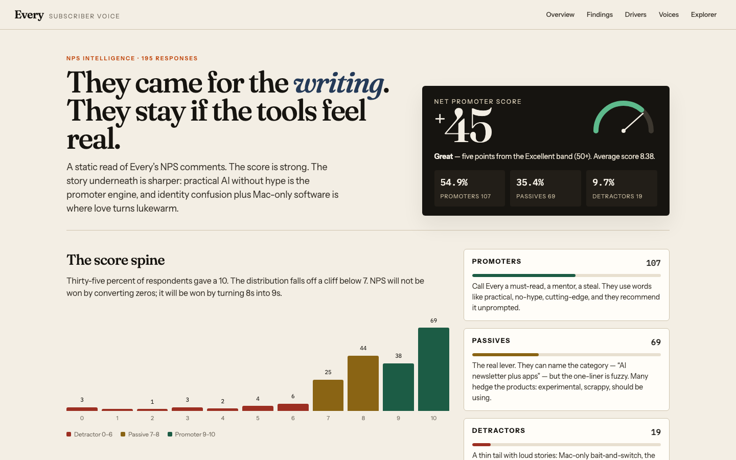

Every NPS: they came for the writing, they stay if the tools feel real
NPS +45 from 195 responses. That is a strong score — Great, five points from the Excellent band (50+). Average rating is 8.38. 55% are promoters, 35% are passives, 10% are detractors. More than a third of everyone in the file gave a 10.
The number is not the story. The comments are.
Every is being scored as a hybrid that has not fully decided which promise is the product. People who experienced “practical AI, minus the noise” become missionaries. People who bought a bundle and met Mac lock-in, unused apps, or a company that used to be “the best writers in tech and business” become quiet — or cancel.
The dashboard is index.html. What follows is the briefing behind it.
Snapshot
| Responses | 195 |
| NPS | +45.1 |
| Average score | 8.38 |
| Promoters (9–10) | 107 · 54.9% |
| Passives (7–8) | 69 · 35.4% |
| Detractors (0–6) | 19 · 9.7% |
| Tens alone | 69 · 35.4% |
Score counts: 10→69, 9→38, 8→44, 7→25, 6→6, 5→4, 4→2, 3→3, 2→1, 1→0, 0→3.
The distribution falls off a cliff below 7. NPS will not be won by converting zeros. It will be won by turning 8s into 9s. If 22 of the 44 eights became nines, NPS would move from 45 to 56.
Seven findings
1. Writing is table stakes. Even the angry people grant it.
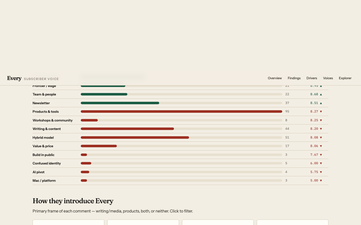
44 comments mention writing, content, essays, journalism, or the blog. Average score 8.20 — slightly below the overall mean, which is the tell.
Detractors still say “good content,” “I like the blog,” “a well-written AI newsletter.” The longest, most devoted promoter comment names Monologue, Cora, and Sparkle, then undercuts them:
To be honest, I am there for the writing. It simply comes out of the noise.
Content quality is not what is moving the score. It is the floor, not the ceiling. Nobody is leaving because the essays are bad. They are leaving (or failing to evangelize) because of identity, products, platform, and trust.
2. Practical, anti-hype AI is the promoter engine.
This is the sentence that converts.
- “Practical / useful / applied / how to use” — 30 mentions, avg 9.00, zero detractors
- Anti-hype language (overwhelm, noise, hype, slop, fluff) — 6 mentions, avg 9.67
- “Best / must-read / go-to / essential / recommended” — 20 mentions, avg 9.30
- Frontier / cutting-edge — 21 mentions, avg 8.95
The promoter’s Every is not “an AI newsletter.” It is a way through the noise: useful, applied, no-slop, someone whose notes you will still want in six months. One 10 called it “the easiest way to stay up to date on AI things without being overwhelmed.” Another: “a no nonsense, no slop company.” Another: “without the usual hype of nonsense.”
If Every needs a public one-liner, it is already in the file: practical AI, minus the hype.
3. The hybrid is the brand — and the source of passives.
31% of respondents (61 people) describe Every as both media and products. Another 31% skip the category entirely and talk in vibes (mentor, gurus, “delights me”). Media-first descriptions actually score highest (avg 8.56). Hybrid is distinctive, and unfinished.
Among hybrid describers, 30 of 61 are passives. They reach for hedges:
- “and some nice software”
- “a few apps bundled with it”
- “some interesting experimental products”
- “Premium newsletter bundle with products I should be using”
- “They build apps and write about it?”
That last one, a 7, is the entire identity with a question mark. Promoters resolve the hybrid into a story (“next gen media company/incubator,” “playbook for how to work AI-first”). Passives can name the parts and not the point.
4. Named products are adored. Generic products are hedged. Mac-only is a churn event.
Products and tools are the most common theme (95 mentions, avg 8.27) — slightly below baseline, because the word “product” is doing very different jobs.
When someone can name the app, the score jumps. Monologue, Cora, Sparkle, LEX: 4 mentions, avg 9.50. One 10: “worth it for the writing alone, incredible benefit for writing + Cora + Monologue (particularly Monologue, which I absolutely adore).”
When they cannot name the app, products become atmospheric: experimental, scrappy, cute, “ones I should be using,” “which I still need to fully use.” The bundle is perceived, not experienced. That is a silent NPS leak among people who already paid.
Mac/Linux lock-in comments average 5.00 (n=3):
- Score 0, about to cancel: marketing talked about tools; after subscribing they learned most are for Mac. Also joined for Claude sessions (8/10), then found Substack more actionable, and called a high-three-figure Claude class out of touch during a shutdown.
- Score 7: wishes the suite ran on Linux.
- Score 8: upgraded after LEX branched off “since most other software offerings are Mac only.”
Mac-only is not a feature footnote. In this file it is a conversion and churn event. Disclose it before purchase.
5. The AI pivot orphaned part of the original audience.
A small cluster, a loud one. Pivot / “not anymore” language averages 5.75.
Two 3s are not about quality. They are about a company that changed what it is:
It was… a collection of the best writers in tech & business as one bundle. Now.. I think it’s “a collection of the best on AI?”
I would [recommend] about 2 years ago, but not anymore. I find Every less interesting after it switched over to AI and building products.
A 10 tells the same plot as a success: “a company that started out as a newsletter collective but has pivoted to being an AI product development house that is at the frontier.” Same story, opposite score. The people who wanted the old writer-collective have not been given a reason to stay except “now we do AI.” Some will not.
6. The zeros are about trust, not taste.
Three scores of 0. None of them are “meh.”
- “Too much.”
- “Good content, but they will abuse the trust and relationship and fleece you for more money.”
- The long cancellation letter: Mac-only after purchase, expensive Claude class, a survey text box so tiny it became evidence that “the ideas that sound good in Every don’t always sound as good outside of Every.”
These are brand-risk comments. The third is also an operations note: if you preach design, the survey cannot look careless. (Assumption: this survey instrument is Every’s; the comment treats it that way.)
Customer service appears once, at 4: “I like the blog, but I find the products very confusing. And I have been underwhelmed with customer service.” Security appears once, at 2: apps unused “for security reason,” while still praising the team as pioneers.
7. Passives are 35%. That is the whole game.
Promoters already evangelize. One told a dozen friends it is “a steal.” Another has “spent a lot of time talking about Every with founders.” Detractors are 10% and vivid, but few.
The middle speaks in generic category language: “AI trends.” “Good content.” “A modern media company.” “No idea honestly.” They have not been given a sentence they can repeat at dinner.
Some passives are already emotionally in. Score 8: “I live vicariously through Every.” Score 8: “Cutting edge and insightful but not easy reading.” Score 7: “It WAS a great resource for how people were using the AI for life and biz.” These people do not need to be acquired. They need a sharper story, working software on their machine, and a reason the hybrid is a feature rather than a shrug.
Workshops punch above their weight when they land (“the value in the workshops/learning session is almost worth it alone”) and become a 0 when they feel extractive. Community/events are not a volume theme (8 mentions) but they are a high-leverage one.
What to do with this
- Make “practical AI without the hype” the public sentence. It is already the highest-scoring idea in the file. Stop leading with a taxonomy (media company / studio / incubator) unless the next clause is what a person can do on Monday.
- Disclose Mac-only before checkout. Treat platform as a promise, not a discovery. The 0 who cancels is describing a trust break, not a preference.
- Activate the bundle. Promoters who have not used the apps are leaving value on the table and cannot name what they paid for. Onboarding that gets someone to a first win in Monologue or Cora would turn hedges into names — and names score 9.5.
- Do not gaslight the original audience. The writer-collective to AI-studio plot can be told as progress (one 10 already does). It also needs a place for people who came for tech-and-business writing that is not only AI. Otherwise those 3s keep compounding as quiet churn.
- Price and packaging are a trust surface. “Fleece you” and the three-figure class comment are not feature requests. They are accusations that the relationship is being harvested. If there is an expensive workshop, the rest of the product has to feel generous in the same month.
- Hunt the 8s, not the 0s. Twenty-two converted eights put Every in Excellent. The 8s already like it. Give them a repeatable one-liner and a product they actually open.
Method and assumptions
- Source:
nps_and_descriptions_only.csv— two fields, NPS score and “How would you describe Every?” - Standard NPS: promoters 9–10, passives 7–8, detractors 0–6. NPS = % promoters − % detractors.
- Themes are overlapping keyword tags, not exclusive codes. A comment can lift more than one bar. Primary frame (hybrid / media / products / other) is mutually exclusive.
- No respondent metadata, plan type, tenure, or survey date was in the file. Treated as a single snapshot of people willing to describe Every in writing.
- Typographical errors in quotes are preserved. One comment redacts an email. One “AL” is read as AI.
- “Platform” as in “a platform about AI” was not counted as Mac lock-in.
Open index.html for the interactive score spine, theme drivers, and all 195 comments.
Checks
9/9Page loadsrenders
the dashboard loads in a headless browser with no console error and paints at least 40 characters of text. Cannot pass without Playwright installed.
Correct NPSnps-correct
the page says "NPS" or "net promoter", and the NPS computed from the source CSV appears on it within 0.15. Missing source data fails closed.
Score breakdowndistribution-shown
"promoter", "passive" and "detractor" all appear, and all three groups carry either their raw count (within 0.01) or their share (within 0.2 of a percentage point). Missing source data fails closed.
Working controlsinteractive
driving a real control -- text/search input, select, button or tab -- changes what the page displays. FAIL when the page could not be driven at all.
Q1Distinctive design
Judge's reasoning
Warm cream/ink editorial palette with green-and-rust accents and a single dark stat card — nowhere near purple-on-black dark mode.
▸Rubric
AI-slop design. Look at `fold.png` and `full.png`. FAIL if the dashboard looks like generic AI-generated design — the reviewer's words: "we should definitely weigh it down if it's purple-black dark mode," and "at the very least, like it shouldn't look like a Vibe Slop, like purple dark mode." The specific tell is a purple-on-black dark-mode treatment (purple/violet/indigo gradients, glow, neon accents on a near-black background). PASS anything that reads as a considered design, light or dark, that isn't that.
Q2Readable typography
Judge's reasoning
Deliberate type system (Fraunces display serif, Instrument Sans body, IBM Plex Mono for numerals) rendering at comfortable sizes with high contrast and no clipping.
▸Rubric
Typography. Look at `fold.png` and `full.png`. FAIL if the type is unconsidered or hard to read — the reviewer's words: "the typography. Like did it pick like good fonts? ... Is, is it like easy to read?" Concrete failure evidence: raw browser-default fonts, low-contrast text, cramped or overflowing/clipped text, sizes so small the numbers and comments are hard to read. PASS if fonts look deliberately chosen and the page is comfortable to read.
Q3Useful findings
Judge's reasoning
The findings section names comment-level patterns not derivable from the score distribution — Mac-only lock-in as a post-purchase churn event (avg 5.00), the AI-pivot cluster orphaning old readers (avg 5.75), and passives who can name the parts but not the point.
▸Rubric
Decision-useful insight. Read the insights section(s) of the dashboard. FAIL if every stated insight is arithmetic restated — counts, percentages, averages, or "X% are promoters" phrased as a finding — with nothing that would help someone decide. The bar, in the reviewer's words: "would this actually be useful for me if I was ... making a decision about whether Every is a good product or not." PASS if at least one insight names a pattern in the comments (a theme, a segment, a tension between what promoters and detractors say) that a reader could act on and that is not derivable from the score distribution alone.
Q4Key facts first
Judge's reasoning
fold.png shows the +45 NPS gauge alongside promoters 54.9%/107, passives 35.4%/69, detractors 9.7%/19 plus the full score histogram.
▸Rubric
Key information above the fold. Look at `fold.png` only. FAIL if the headline NPS number and the promoter/passive/detractor breakdown are not both visible without scrolling. The reviewer's words: "does it, does it like put the important information above the fold? ... That's the main thing for me."
Q5Useful headline
Judge's reasoning
"They came for the writing. They stay if the tools feel real." states a specific, data-supported tension from this survey (writing praised even by detractors; product/platform friction driving the low scores) rather than a generic label.
▸Rubric
The headline earns its place. Look at `fold.png` and read the dashboard's own top-level title/headline — the line the page leads with, not the browser tab title and not a section heading. This asks two things of one line, and FAILs if either is missing. It must (a) say what this particular data showed, and (b) be worth reading. FAIL if the headline is a bare label that would sit unchanged on any NPS dashboard for any product — "NPS Dashboard", "Every NPS Results", "Customer Feedback Analysis", "Survey Results Overview" — or if it is a naked metric restated as a title. FAIL also if it reaches for interest at the cost of accuracy: a claim the data on the page does not support. PASS if someone who read only that line would learn something true and specific about this survey, and would want to look at the rest. The reviewer's words: *"is the headline a good concise summary of the content while being interesting?"*