Mike's Checks/gpt-5.6-luna/01 dashboard
01 dashboard
gpt-5.6-lunaCodex CLIhigh effortrun 22 Aug 2026
▸Instructions — the case's current instructions; none were saved with this result
I want you to build a static html NPS dashboard and pick out interesting insights after doing analysis of the comments
Answer
Every NPS dashboard — analysis readout
Deliverable: Open the static NPS dashboard
Headline
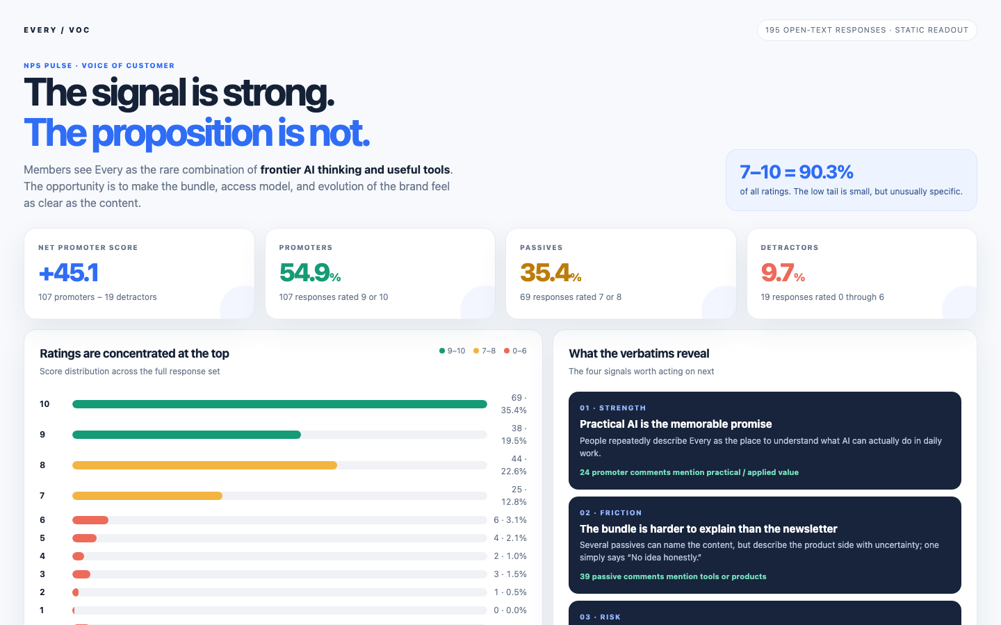
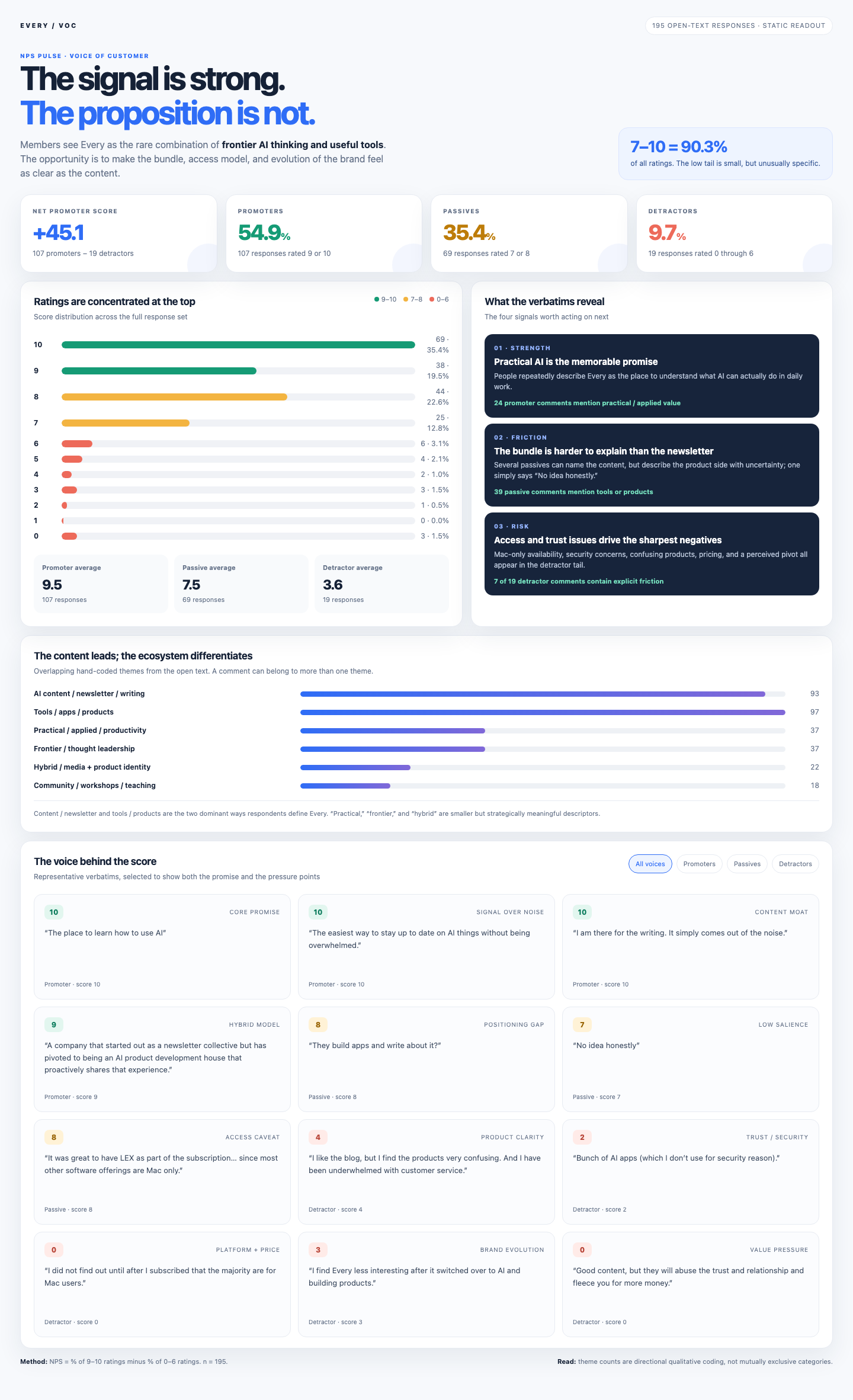
Every scores +45.1 NPS across 195 open-text responses. The score is healthy and top-heavy: 107 promoters (54.9%), 69 passives (35.4%), and 19 detractors (9.7%). The median response is 9 and the mean is 8.38. In total, 176 of 195 responses (90.3%) are 7–10.
What members value
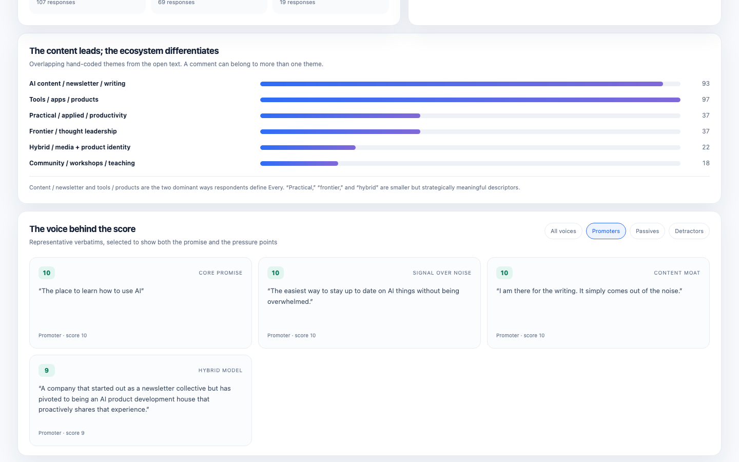
- Every is most often understood as a combination of an AI newsletter/publication and a suite of AI tools or products.
- The strongest qualitative promise is practical, applied AI: helping people understand and use AI in daily work without hype or overwhelm.
- Promoters especially use language around frontier thinking, high-signal analysis, usefulness, productivity, and “learning how to use AI.”
- The hybrid model is a differentiator: people like that the team builds products and shares what it learns while building them.
What is holding the score back
- Product clarity: some respondents can describe the writing easily but cannot explain the product suite; one passive answer is simply “No idea honestly,” and a detractor calls the products confusing.
- Access expectations: Mac-only availability is a repeated concrete complaint in the low-score tail. It is especially damaging when tool availability is discovered after subscribing.
- Trust, security, and price: one detractor does not use the apps for security reasons; another describes pricing and monetization as a breach of trust. A high-priced Claude class is also called out as out of touch.
- Brand evolution: a few former fans perceive a shift away from the earlier broader tech/business writer bundle toward AI and product building, making Every feel less interesting or less relevant to them.
- Experience consistency: the long detractor response criticizes the survey text box itself, suggesting that design-sensitive members notice gaps between Every’s product/design philosophy and the surrounding customer experience.
Recommended actions
- Make the subscription promise concrete above the paywall: show the content, product list, supported platforms, eligibility, and what is included today.
- Add a simple “start here” path for products, with use cases, setup time, security posture, platform support, and a recommended first app.
- Treat platform coverage and security as conversion/trust content, not footnotes. Make limitations visible before purchase.
- Explain the evolution from media collective to AI-native product studio in a way that preserves the original editorial value for members who joined for writing.
- Protect the content moat while improving activation: the comments suggest many members value the writing alone, while the software bundle is the differentiator that needs clearer proof of value.
Method note
NPS is calculated as the share of 9–10 ratings minus the share of 0–6 ratings. The theme counts in the dashboard are directional, overlapping qualitative coding of the comments; a single response can mention multiple themes. No interactive questions or missing-data assumptions were required because the supplied CSV had a score and description for all 195 rows.
Checks
9/9Page loadsrenders
the dashboard loads in a headless browser with no console error and paints at least 40 characters of text. Cannot pass without Playwright installed.
Correct NPSnps-correct
the page says "NPS" or "net promoter", and the NPS computed from the source CSV appears on it within 0.15. Missing source data fails closed.
Score breakdowndistribution-shown
"promoter", "passive" and "detractor" all appear, and all three groups carry either their raw count (within 0.01) or their share (within 0.2 of a percentage point). Missing source data fails closed.
Working controlsinteractive
driving a real control -- text/search input, select, button or tab -- changes what the page displays. FAIL when the page could not be driven at all.
Q1Distinctive design
Judge's reasoning
Light off-white background with navy/blue and green-amber-red accents; no purple-on-black neon dark-mode treatment.
▸Rubric
AI-slop design. Look at `fold.png` and `full.png`. FAIL if the dashboard looks like generic AI-generated design — the reviewer's words: "we should definitely weigh it down if it's purple-black dark mode," and "at the very least, like it shouldn't look like a Vibe Slop, like purple dark mode." The specific tell is a purple-on-black dark-mode treatment (purple/violet/indigo gradients, glow, neon accents on a near-black background). PASS anything that reads as a considered design, light or dark, that isn't that.
Q2Readable typography
Judge's reasoning
Deliberate geometric sans with a large tight-tracked display headline, clear hierarchy, high-contrast readable body text, and no clipping or cramping.
▸Rubric
Typography. Look at `fold.png` and `full.png`. FAIL if the type is unconsidered or hard to read — the reviewer's words: "the typography. Like did it pick like good fonts? ... Is, is it like easy to read?" Concrete failure evidence: raw browser-default fonts, low-contrast text, cramped or overflowing/clipped text, sizes so small the numbers and comments are hard to read. PASS if fonts look deliberately chosen and the page is comfortable to read.
Q3Useful findings
Judge's reasoning
Insights name comment-level patterns — passives can describe the newsletter but not the bundle, and detractors cluster on Mac-only access, security, pricing, and a perceived pivot — none derivable from the score distribution.
▸Rubric
Decision-useful insight. Read the insights section(s) of the dashboard. FAIL if every stated insight is arithmetic restated — counts, percentages, averages, or "X% are promoters" phrased as a finding — with nothing that would help someone decide. The bar, in the reviewer's words: "would this actually be useful for me if I was ... making a decision about whether Every is a good product or not." PASS if at least one insight names a pattern in the comments (a theme, a segment, a tension between what promoters and detractors say) that a reader could act on and that is not derivable from the score distribution alone.
Q4Key facts first
Judge's reasoning
fold.png shows +45.1 NPS alongside promoter 54.9%, passive 35.4%, and detractor 9.7% cards without scrolling.
▸Rubric
Key information above the fold. Look at `fold.png` only. FAIL if the headline NPS number and the promoter/passive/detractor breakdown are not both visible without scrolling. The reviewer's words: "does it, does it like put the important information above the fold? ... That's the main thing for me."
Q5Useful headline
Judge's reasoning
"The signal is strong. The proposition is not." states a specific, data-supported tension between the high scores and the confusion in the verbatims rather than a generic label.
▸Rubric
The headline earns its place. Look at `fold.png` and read the dashboard's own top-level title/headline — the line the page leads with, not the browser tab title and not a section heading. This asks two things of one line, and FAILs if either is missing. It must (a) say what this particular data showed, and (b) be worth reading. FAIL if the headline is a bare label that would sit unchanged on any NPS dashboard for any product — "NPS Dashboard", "Every NPS Results", "Customer Feedback Analysis", "Survey Results Overview" — or if it is a naked metric restated as a title. FAIL also if it reaches for interest at the cost of accuracy: a claim the data on the page does not support. PASS if someone who read only that line would learn something true and specific about this survey, and would want to look at the rest. The reviewer's words: *"is the headline a good concise summary of the content while being interesting?"*