Mike's Checks/claude-fable-5/09 pptx
09 pptx
claude-fable-5Claude Codehigh effortrun 22 Aug 2026
▸Instructions — the case's current instructions; none were saved with this result
create a powerpoint in the every brand style on compound engineering, 30 min session https://every.to/guides/compound-engineering
A pptx skill is in skills/pptx/ — read skills/pptx/SKILL.md first. pptxgenjs is installed in the workspace, so require("pptxgenjs") works from here with no network. The brand guide is every-visual-style.md.
Answer
Checks
12/15No overlapping textno-overlap
no two text-bearing shapes on a slide overlap materially (Mike's first question: "Is the writing overlapped?")
Brand colorspalette
share of rendered pixels on Every's documented palette, and whether the deck stays inside one theme (needs Pillow)
Deck opensopens
a .pptx exists and parses (python-pptx when installed, stdlib zip+XML otherwise)
Slide countslide-count
8-20 slides -- sane for a 30-minute session
Slides renderrender
every slide rendered to a PNG in <output-dir>/_screenshots/ via LibreOffice (soffice --convert-to pdf) + pdftoppm. FAIL when required render tools are unavailable.
Q1Readable slides
Judge's reasoning
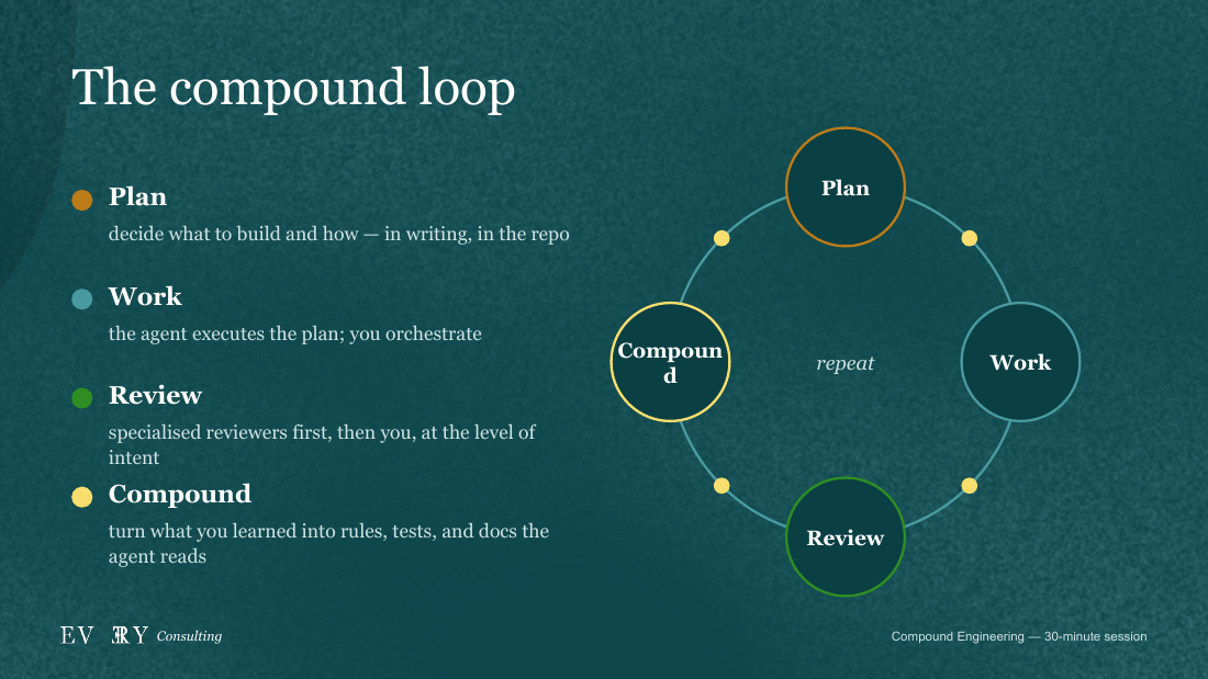
On slide 6 the centerpiece loop diagram breaks 'Compound' mid-word across two lines as 'Compoun / d', overflowing the circle's width; additionally the footer wordmark renders garbled on all 16 slides as 'EV ЭRY' because the mirrored E in logo.svg collides with the R.
▸Rubric
Every slide is legible as rendered. FAIL if any slide has text running off the edge, text clipped by its container, text over an image or shape at unreadable contrast, or headline and body colliding. (A separate script check already catches overlapping text boxes; this question covers what the geometry check cannot see — overflow, clipping and contrast in the actual render.)
Q2Every's color palette
Judge's reasoning
Consistent Theme 2 throughout — Teal Dark #0F5258 background with stipple texture, #4999A0 depth sweeps, Warm White #FFFEFB text, gold #BB7B19/#F8DE6E and green #2E8D23 accents (slides 1-16); no Theme 1 colors appear anywhere in build.js.
▸Rubric
The palette is Every's. Theme 1 (Editorial): background Every Black `#121212` (or Warm Cream `#F5F2ED` for light slides), Every Blue `#C0F0FB` as the signature accent, white text, with `#FA7B20` / `#E9731E` / `#C4400F` / `#349361` / `#1324CB` / `#7301CC` as accents. Theme 2 (Consulting): background Teal Dark `#0F5258` with Teal Medium `#4999A0` for depth, Warm White `#FFFEFB` text, `#BB7B19` / `#F8DE6E` / `#2E8D23` accents. FAIL if the deck's colors are visibly not these — corporate blue, generic slide-template gray, purple-black AI dark mode, neon gradients — or if it flips between the two themes across slides. Close-but-different shades are fine; a different palette is not.
Q3Serif typography
Judge's reasoning
All headlines and body are Georgia serif (build.js:22, 54); Arial is used only for the eyebrow labels ('Step 1 of 4', slide 7), the footer session indicator and the quote attribution on slide 4 — exactly the small-label exception the guide allows.
▸Rubric
Typography is serif. The brand is serif-first: Signifier, or its documented PowerPoint substitutes Georgia and Times New Roman. Sans-serif (Switzer / DM Sans) is allowed only for small labels — session indicators, footers, captions. FAIL if headlines or body text are set in a sans-serif face (Arial, Helvetica, Calibri, Inter). "Sans-serif for main content" is on the brand guide's explicit avoid list.
Q4No banned decoration
Judge's reasoning
Only rounded rectangles, pills and ovals with thin 0.75–1.5pt single borders; no triangles, hexagons, diagonal slashes, corner brackets, drop shadows, stock photos, gradient backgrounds or rotated/outlined text on any slide.
▸Rubric
No forbidden decoration. The brand guide bans, in both themes: triangles, hexagons and other geometric accents; diagonal slashes and hard section dividers; corner brackets or L-shaped frames; drop shadows on boxes; heavy or double borders; stock photography; gradient backgrounds; rotated or outlined text. FAIL if any of these appears on any slide.
Q5Required design elements
Judge's reasoning
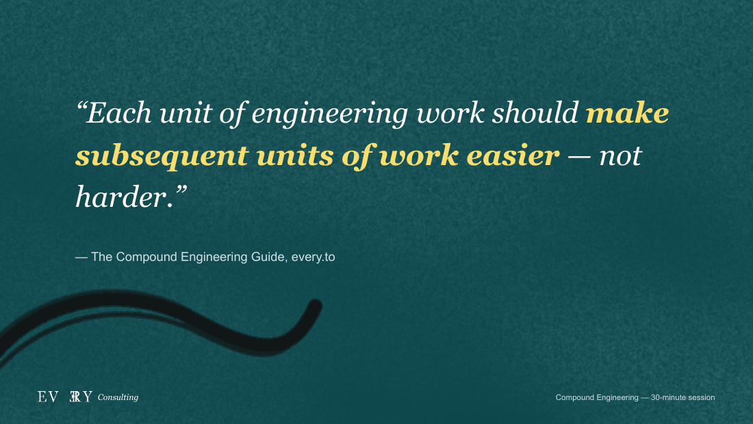
Organic swooshes appear on 12 of 16 slides (build.js base({swooshes:...})), with explicit brushstrokes carrying slides 4, 12 and 16 — well above one-in-three; classical stippled illustration is absent, which weakens the look, but the swoosh requirement is met.
▸Rubric
The signature elements are there. Every decks carry organic brushstroke swooshes (the E / O / R SVG shapes, cropped at the slide edge, scaled large) and stippled classical illustrations — Greek and Roman architecture, figures, busts, sometimes with modern elements. The guide says to use the swooshes "liberally once every two or three slides." FAIL if the deck has neither swooshes nor classical illustration, or if such elements appear on fewer than roughly one slide in three. Mike's question on this eval: "does it use the, uh, SVGs?"
Q6Consistent footer
Judge's reasoning
The base() helper stamps EVERY + italic 'Consulting' left and 'Compound Engineering — 30-minute session' right on every slide including title and closer (slides 1-16), with no omissions.
▸Rubric
The footer is consistent. Theme 1: EVERY logo left, `every.to` right. Theme 2: EVERY *Consulting* left, session indicator right. FAIL if content slides carry no footer, or if the footer appears on some and not others.
Q7Enough substance
Judge's reasoning
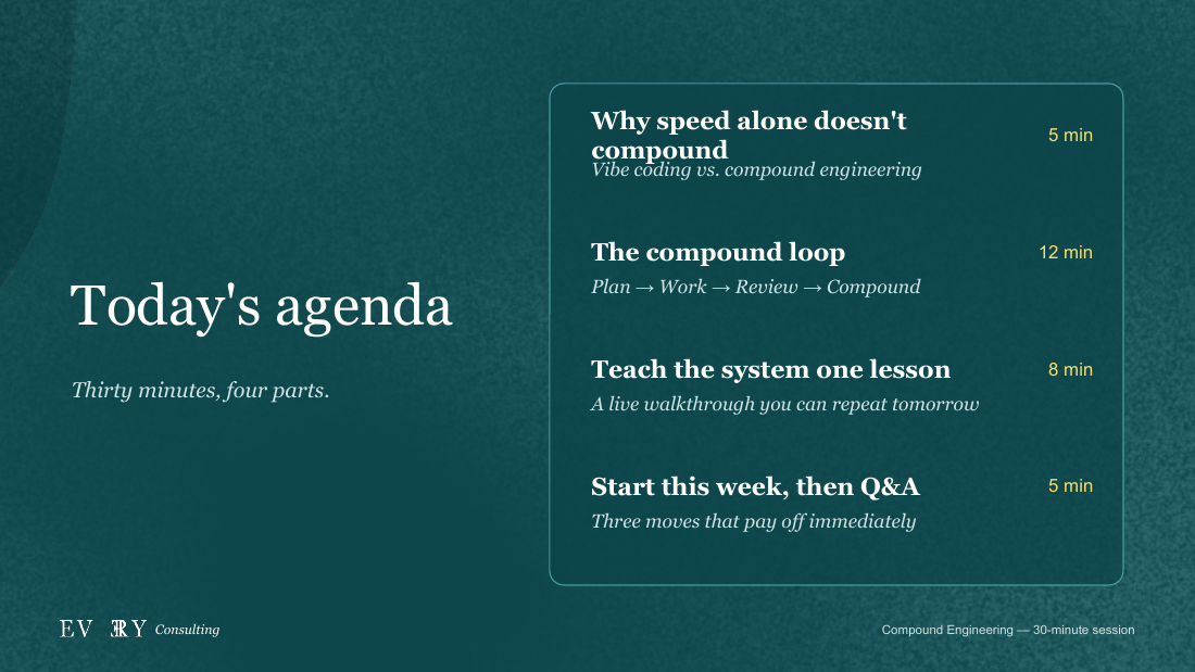
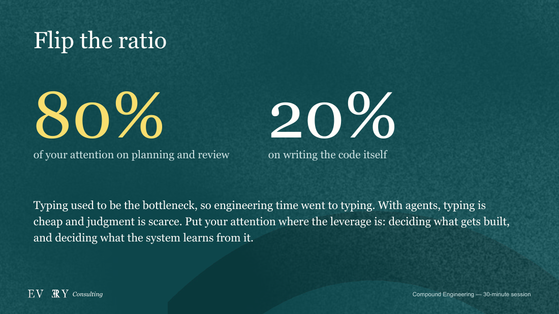
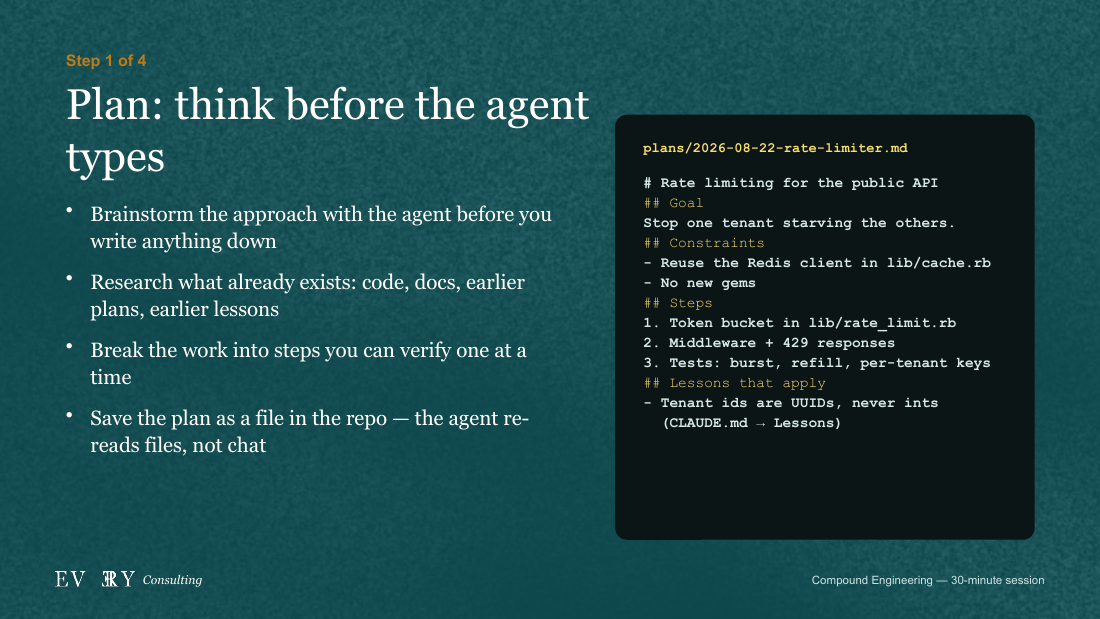
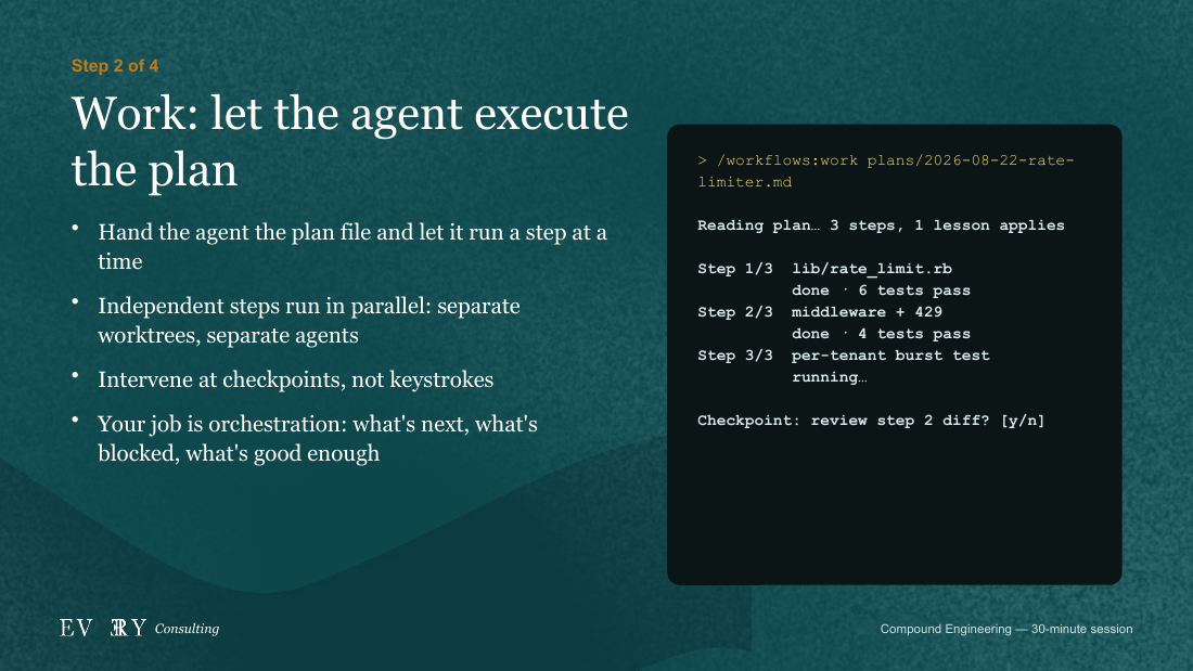
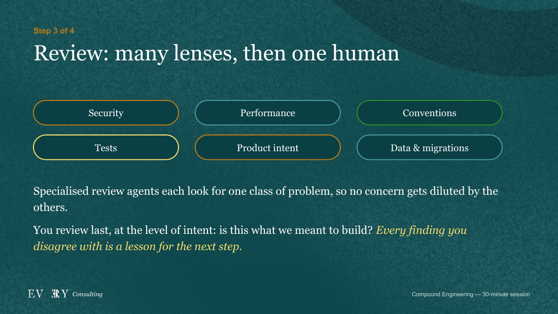
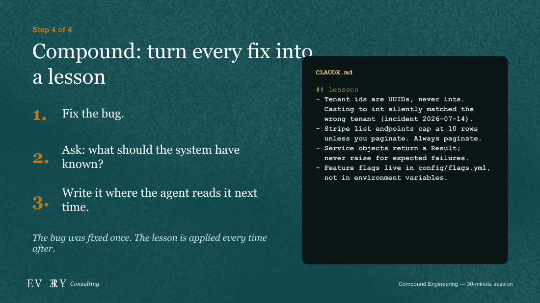
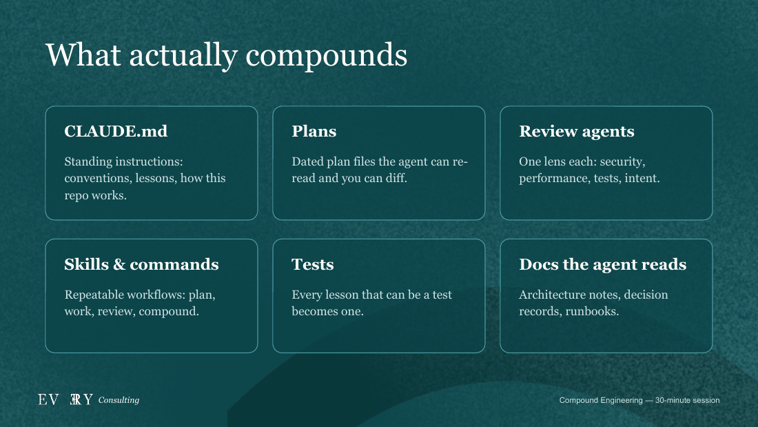
Carries the guide's load-bearing substance: the plan→work→review→compound loop with compound named as the differentiator (slides 2, 6, 10), the 80/20 attention flip (slide 5), the thesis quote (slide 4), and the concrete artifacts — CLAUDE.md lessons, dated plan files, specialised review agents, skills/slash commands (slides 7-11, 15); the 0→5 staged path is the one notable omission.
▸Rubric
The content has real depth. Mike: "the main failing of the decks generated by AI is still the content is quite shallow." The deck must carry the load-bearing substance of the compound-engineering guide — for example the four-step loop (plan → work → review → **compound**) with the compound step named as the thing that separates it from ordinary AI-assisted work, the 80/20 split where planning and review take most of an engineer's time, the specific compounding artifacts (CLAUDE.md, reusable agents, skills, slash commands), the beliefs the philosophy asks you to drop, and the staged 0→5 path. FAIL if the deck could have been written without ever reading the guide — generic "AI makes engineers faster / here are some prompting tips" content, or claims about compound engineering that the guide does not support.
Q8Interesting material
Judge's reasoning
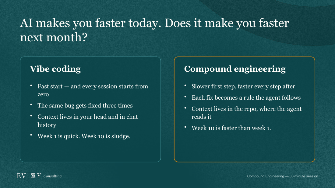
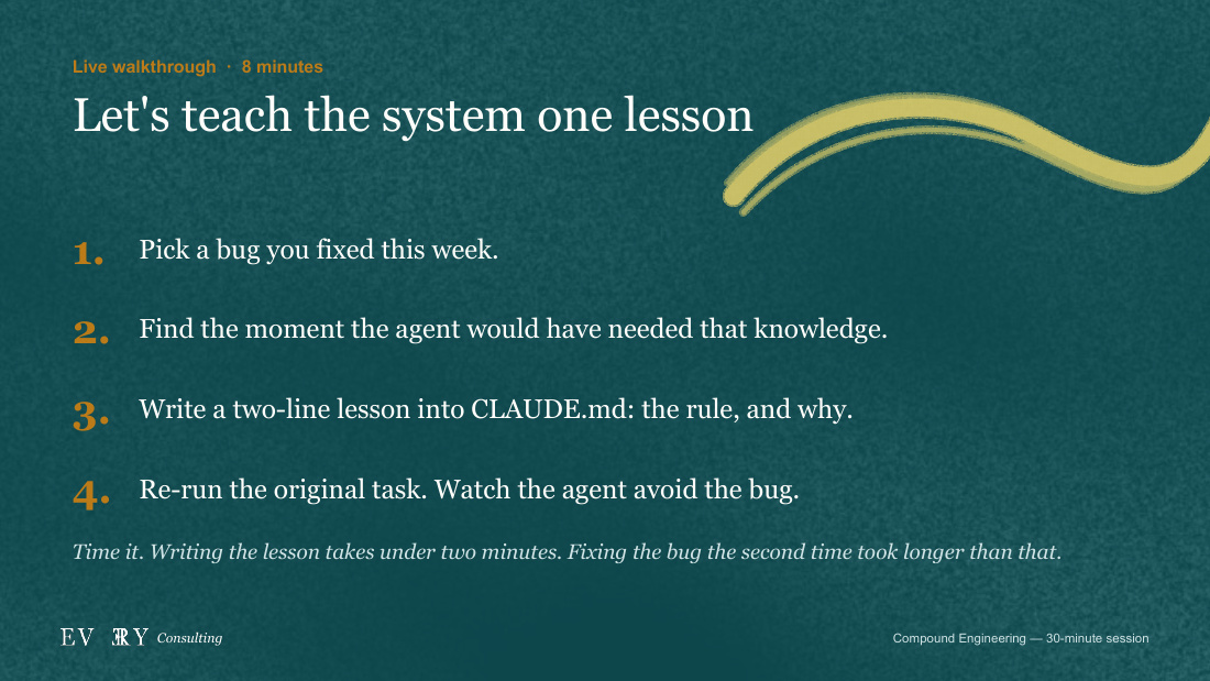
Not a heading dump — it opens with a POV hook ('AI makes you faster today. Does it make you faster next month?', slide 3), spends the bulk of time on the loop, then adds material the guide does not sequence this way: a live 8-minute exercise (slide 12), failure modes (slide 14) and three concrete moves for this week (slide 15).
▸Rubric
It picked interesting things to say. Mike's question on this eval: "does it pick out interesting things to write about." A 30-minute session forces a choice about what matters. FAIL if the deck is a table of contents of the guide — one slide per heading, in the guide's order, with the headings restated and no point of view about what this audience should take away.
Q9One idea per slide
Judge's reasoning
Each slide has a single organizing idea — slide 5 is one statistic, slide 6 one diagram, slide 9 one point about layered review; the densest slides (11's six artifact cards, 14's four failure modes) are single taxonomies with generous margins rather than competing ideas.
▸Rubric
One idea per slide. Mike: it fails "if it tries to fit too many ideas on one slide." The brand guide says the same thing — "clear focal point: one main message per slide," "spacious, not cluttered." FAIL if any single slide carries more than one idea, or is packed so densely that a room could not read it while the presenter talks.
Q10Useful visuals
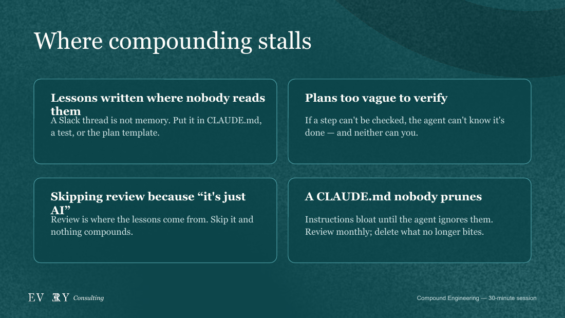
Judge's reasoning
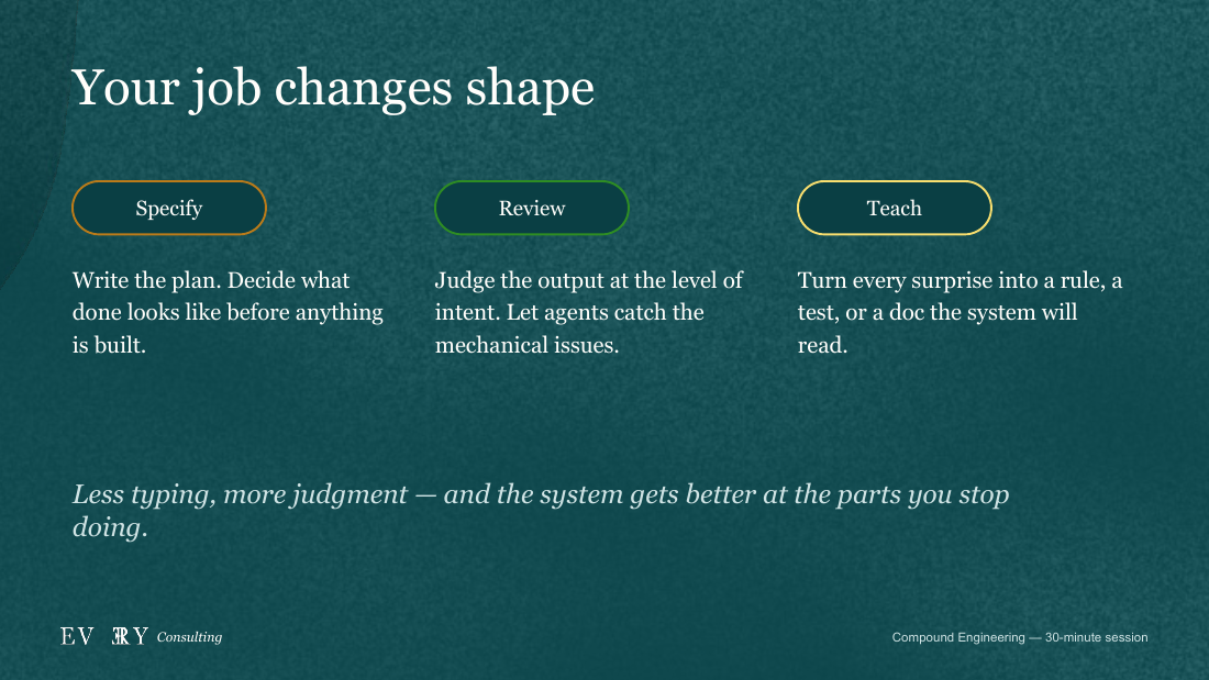
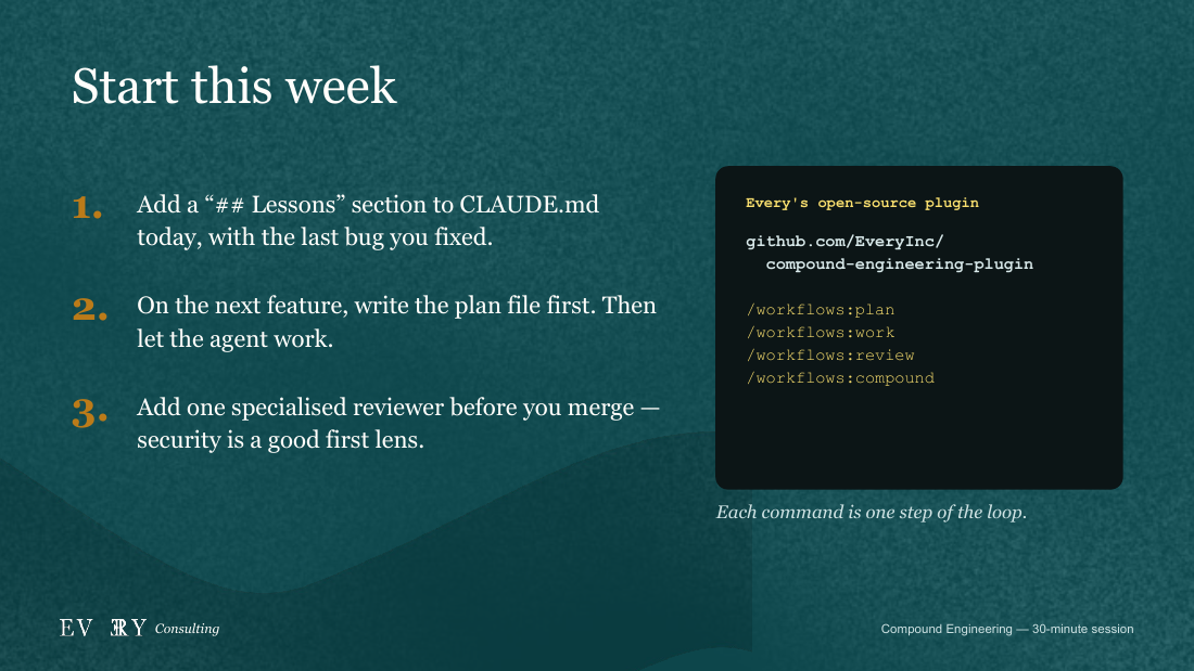
Real visual carriers dominate: the circular four-node loop diagram (slide 6), the 80%/20% typographic stat (slide 5), pill rows (slides 9, 13), card grids (slides 11, 14), quote-with-brushstroke (slide 4) and four terminal/file artifact panels (slides 7, 8, 10, 15); only slides 3, 7 and 8 use literal bullets, a clear minority.
▸Rubric
Real visual elements, not walls of bullets. Mike's question: "does it create good visual elements." Real means: a diagram of the loop, a staged progression, a 50/50 split with illustration, a quote in an organic blob, a comparison built from shapes — something that carries meaning visually. FAIL if the majority of content slides are a title plus a bulleted list.