Mike's Checks/claude-fable-5/01 dashboard
01 dashboard
claude-fable-5Claude Codehigh effortrun 22 Aug 2026
▸Instructions — the case's current instructions; none were saved with this result
I want you to build a static html NPS dashboard and pick out interesting insights after doing analysis of the comments
Answer

Every — NPS survey analysis
Deliverables
index.html— static, self-contained NPS dashboard (open directly in a browser; no server or network needed). KPIs, score distribution, segment mix, theme analysis, identity-framing analysis, 11 insight cards with supporting verbatims, and a filterable/searchable explorer of all 195 comments.ANSWER.md— this summary of insights.analyze.py→nps_analysis.json— reproducible analysis (NPS, theme tagging, framing stats).build_dashboard.pyrenders the HTML from the JSON.
Data: nps_and_descriptions_only.csv, 195 responses, two columns: NPS score (0–10) and the open-text answer to "How would you describe Every?"
Assumptions made: standard NPS cut-offs (9–10 promoter, 7–8 passive, 0–6 detractor); no date or customer metadata was supplied, so there is no trend or cohort split; themes were assigned by keyword/regex rules and then hand-checked against every comment, so counts are indicative rather than exact. Note the open-text question asks people to describe Every, not to justify their score — so sentiment is inferred from how people chose to describe it.
Headline numbers
| Metric | Value |
|---|---|
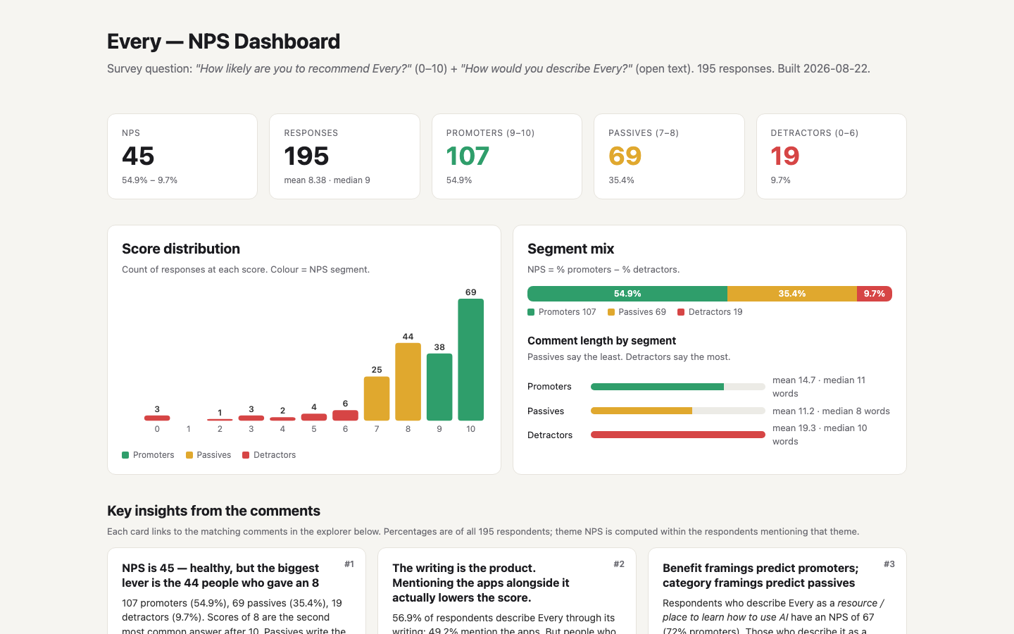
| NPS | 45 |
| Responses | 195 |
| Promoters (9–10) | 107 (54.9%) |
| Passives (7–8) | 69 (35.4%) |
| Detractors (0–6) | 19 (9.7%) |
| Mean / median score | 8.38 / 9 |
| Most common scores | 10 (69), 8 (44), 9 (38), 7 (25) |
NPS of 45 is solidly good for a paid media/subscription product. The structure of the distribution matters more than the headline: the detractor base is small (10%) and the passive base is large (35%), with 8 the second most common score. The upside is in converting 8s, not in fixing 0s.
Insights from the comments
1. Passives know what Every is but not why it matters
Passives write the shortest, flattest descriptions — median 8 words vs 11 for promoters and 10 for detractors — and they are almost all category labels: "A modern media company", "AI trends", "Good content", "An AI product lab", "Tech/AI magazine slash software incubating studio". Promoters, by contrast, describe an outcome ("The place to learn how to use AI") or a feeling ("Delights me"). The passive who comes closest to explaining their 8 says it directly: "an eclectic forward-looking newsletter that I pay a decent amount for but somehow it's worth it." Value is felt, but not articulated.
2. The writing is the product. Mentioning the apps alongside it lowers the score.
57% of respondents describe Every through its writing; 49% mention the apps. But framing matters:
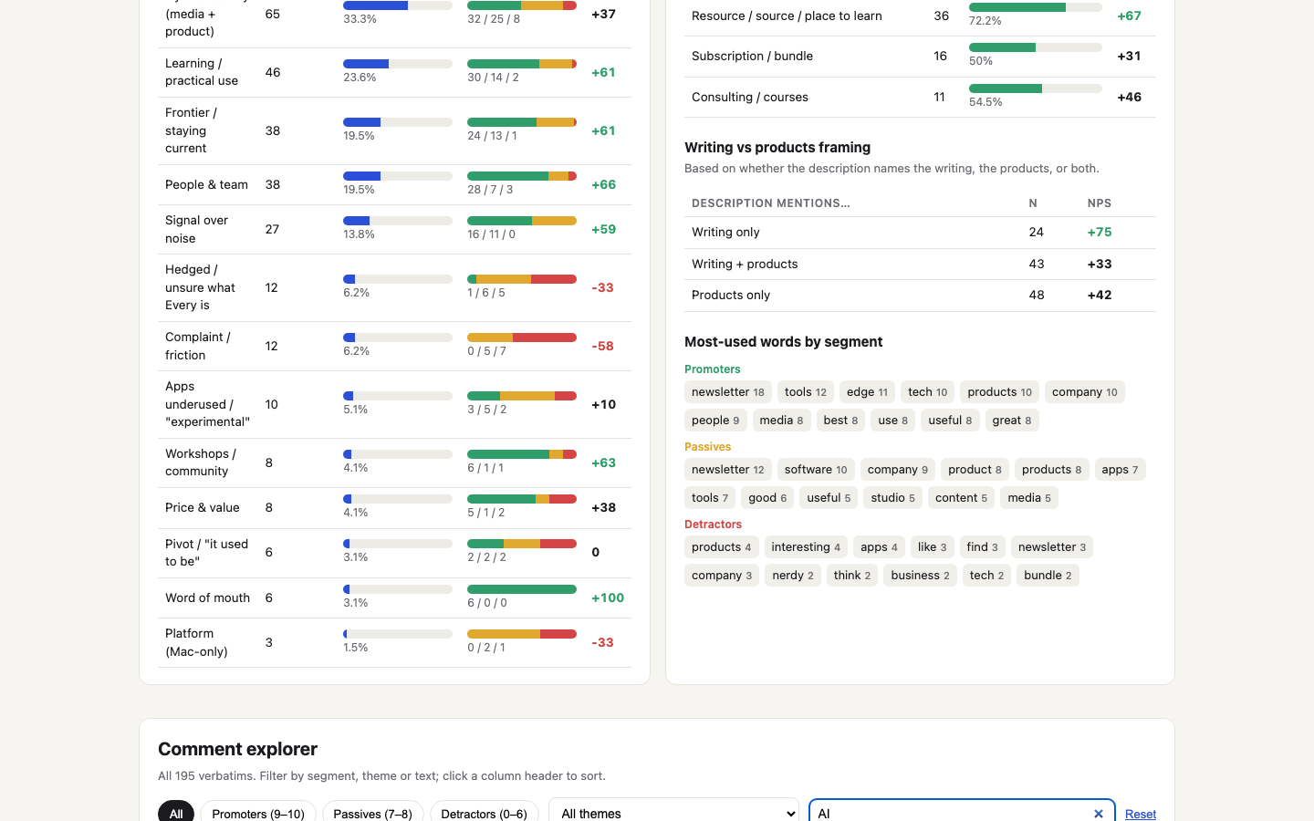
| Description mentions… | n | NPS |
|---|---|---|
| Writing only | 24 | +75 |
| Products only | 48 | +42 |
| Writing + products | 43 | +33 |
Promoters themselves say the apps are secondary: "I am there for the writing. It simply comes out of the noise." (10), "Subscription would be worth it for the writing alone" (10), "a whole bunch of useful apps… (which I still need to fully use!)" (10). Passives echo it with less warmth: "Premium newsletter bundle with products I should be using" (8), "Newsletter and early AI products" (8), "cute software products" (8), "scrappy software products" (7), "interesting experimental products" (7). The apps are currently a co-star that dilutes the story for a meaningful slice of subscribers, and ~10 respondents explicitly signal that they are not using them.
3. Benefit framings predict promoters; category framings predict passives
| How the respondent categorises Every | n | Promoter share | NPS |
|---|---|---|---|
| Resource / source / place to learn | 36 | 72% | +67 |
| Company / team / people | 41 | 61% | +51 |
| Studio / lab / incubator | 21 | 52% | +52 |
| Newsletter / publication | 67 | 55% | +48 |
| Products / apps / tools | 91 | 47% | +37 |
| Subscription / bundle | 16 | 50% | +31 |
The words "actually", "practical", "how to use AI" appear in 15 promoter comments, 5 passive comments and 0 detractor comments ("The best resource for having any hope of actually using AI in your daily work", "A place to learn about how ai is actually used", "smartest people i've found talking about how to actually leverage ai"). The positioning that converts is "the place to learn how to actually use AI", not "newsletter + app bundle" — which is how the 4-scorer put it: "A sub to a bundle of apps."
4. "Signal over noise" is the emotional core — and it has zero detractors
27 respondents praise Every for filtering the AI firehose, and not one of them is a detractor (NPS +59). The language is consistent: "without getting overwhelmed" (×2), "no fluff", "no slop", "no nonsense", "without the usual hype of nonsense", "comes out of the noise", "Rather than trying to catch up on every piece of AI news, I find it far more efficient—and much more insightful—to learn from the things you share." Frontier language ("cutting edge" ×6, "bleeding edge" ×3, "frontier", "front lines") shows the same split — 13 promoters, 4 passives, 0 detractors. Curation is the value; the frontier is merely the subject.
5. Identity confusion is a detractor signal
12 respondents hedged or literally couldn't answer: "No idea honestly" (7), "I don't know" (6), "They build apps and write about it?" (7), "An AI content and product studio ?" (7), "that's a hard one" (10), "Interesting hybrid company" (8), "Kinda weird intersection of nerdy AI shit and crafty business thinking" (5). NPS in this group: −33. A further third of all respondents (33%) reach for a hybrid construction — "media co meets blog meets startup studio", "magazine slash software incubating studio" — and that group scores below average (NPS +37). The "what is Every?" question is still doing work against you.
6. The pivot to AI is costing pre-AI-era subscribers
Six respondents describe Every as something it used to be, and three of the lowest scores in the survey are in that group:
- "It was... a collection of the best writers in tech & business as one bundle. Now.. I think it's 'a collection of the best on AI?'" (3)
- "I would about 2 years ago, but not anymore. I find Every less interesting after it switched over to AI and building products" (3)
- "It WAS a great resource for how people were using the AI for life and biz" (7)
Two promoters describe the same pivot approvingly ("started out as a newsletter collective but has pivoted to being an AI product development house that is at the frontier"), so this is not a verdict on the strategy — it's a churn-risk cohort that the writer-collective era acquired and the AI era isn't retaining. With no tenure data in the file, this can't be sized, but it's worth a cohort cut of churn by signup date.
7. The people are a differentiator — promoters describe humans, passives describe categories
38 respondents describe Every through its people (NPS +66; 28 promoters vs 7 passives). The adjectives are unusual for a media brand: "humble (willing to be honest about failures or blindspots)", "humility", "non-ego oriented", "abundance mindset", "educators at heart", "a mentor, a buddy in a multiplayer game who opened a hidden part of the map and tells you to follow them." Dan Shipper is the only individual named. Superlatives ("best", "must-read", "go-to", "top 3", "in the world") appear in 18 promoter comments vs 3 passive comments.
8. Mac-only is small but sharp: 3 mentions, 0 promoters, 1 cancellation
Only three respondents raise platform, but every one is a non-promoter and one 0-scorer says it is why they are leaving: "While the marketing talks about the tools I can use, I did not find out until after I subscribed that the majority are for Mac users." A 7 wishes the suite "ran on additional platforms besides Mac — Linux, especially"; an 8 notes Lex was valued precisely because it was the non-Mac product, and its spin-out was felt ("I upgraded after it branched off"). Stating platform requirements on the pricing page is a cheap fix for an expensive surprise.
9. Price sentiment is polarised — and two of the three zeros are about money and trust
Promoters: "I tell them it's a steal!", "Good value", "worth it for the writing alone." Detractors: "Good content, but they will abuse the trust and relationship and fleece you for more money" (0); "I think you were out of touch offering a High three figure Claude class" (0). Both zeros are about additional asks of existing subscribers — upsells appear to be where trust is being spent. The median view is the passive's: "a newsletter that I pay a decent amount for but somehow it's worth it."
10. Word-of-mouth is already happening, unprompted
Asked only to describe Every, six respondents volunteered that they already recommend it — "I have told approximately a dozen friends", "Have recommended it to two other people", "I've spent a lot of time talking about Every with founders", "It's where I send people who want to understand…" All six are promoters (NPS +100 in that group). A referral mechanism would harvest behaviour that already exists.
Named product love is concentrated: Monologue (3 mentions, "which I absolutely adore"), Cora (2, "just a short trial, but it was effective"), Sparkle (1), Lex (1). Workshops / Claude sessions / community get 8 mentions at NPS +63 ("The value in the workshops/learning session is almost worth it alone", "really beneficial workshops", "learn alongside others while you teach") — and even the 0-scorer rated the Claude sessions 8/10. If the apps need a front door, Monologue is it; if the bundle needs a second pillar, it's the live learning.
11. Detractors are engaged, specific and fixable
Detractors write the longest comments (mean 19 words vs 15 promoters, 11 passives) — the unhappy minority cares enough to explain. Their complaints are concrete:
- confusing product line-up and "underwhelmed with customer service" (4)
- apps unusable "for security reason" (2) — likely a corporate/IT constraint
- Mac-only (0, 7, 8)
- too technical / too dense: "Nerdy" (6), "nerdy AI shit" (5), "Cutting edge and insightful but not easy reading" (7), "non-stop claude if you're into that sort of thing" (7)
- the survey itself: "did anyone at Every try to use this survey tool? The text box is so tiny… It seems odd that a company preaches design and aesthetics has such a poor experience when asking about user experience." (0)
There is also an audience tension worth watching: one 9 calls Every "designed and communicated for non-engineers" while another calls it "a must have if you're a developer in 2025". Some passives and detractors are finding the current mix too technical.
What I'd do with this
- Lead with the writing and the outcome ("learn how to actually use AI"); make the apps an earned discovery, not the headline of the bundle. The data says the writing-only framing produces the happiest subscribers and that "bundle" framing produces the least happy.
- Fix the app onboarding: ~10 respondents (including 10-scorers) admit they don't use the apps. Start with Monologue, the only app people spontaneously say they love.
- Put platform requirements (macOS) on the pricing page. It's one line and it cost at least one subscriber.
- Audit upsells to existing subscribers (high-ticket courses, "Claude class"). Both money-related zeros are about being asked for more after subscribing.
- Run a tenure cohort cut of churn to size the pre-AI-era attrition the comments hint at.
- Add a referral path — promoters are already recommending by the dozen.
- Fix the survey text box. A detractor told you so, at length.
Method notes
- NPS = % promoters − % detractors = 54.9 − 9.7 = 45.1.
- Themes: regex rules in
analyze.py(THEMESdict), reviewed against every comment and adjusted (e.g. case-sensitive "WAS" for the pivot theme; "platform" excluded from the Mac-only theme). A comment can carry several themes. - Per-theme NPS on small groups (n < 15: Mac-only, pivot, word of mouth, price, workshops, apps-underused) is directional only.
- "Identity framing" and "writing vs products framing" are keyword-based: a description counts as mentioning writing if it uses newsletter/publication/magazine/blog/media/journalism etc., and products if it uses apps/tools/software/products.
Checks
8/9Page loadsrenders
the dashboard loads in a headless browser with no console error and paints at least 40 characters of text. Cannot pass without Playwright installed.
Correct NPSnps-correct
the page says "NPS" or "net promoter", and the NPS computed from the source CSV appears on it within 0.15. Missing source data fails closed.
Score breakdowndistribution-shown
"promoter", "passive" and "detractor" all appear, and all three groups carry either their raw count (within 0.01) or their share (within 0.2 of a percentage point). Missing source data fails closed.
Working controlsinteractive
driving a real control -- text/search input, select, button or tab -- changes what the page displays. FAIL when the page could not be driven at all.
Q1Useful headline
Judge's reasoning
The top-level headline is 'Every — NPS Dashboard', a bare label that would sit unchanged on any NPS dashboard for any product, and the subtitle beneath it only restates the survey question and response count rather than what this data showed.
▸Rubric
The headline earns its place. Look at `fold.png` and read the dashboard's own top-level title/headline — the line the page leads with, not the browser tab title and not a section heading. This asks two things of one line, and FAILs if either is missing. It must (a) say what this particular data showed, and (b) be worth reading. FAIL if the headline is a bare label that would sit unchanged on any NPS dashboard for any product — "NPS Dashboard", "Every NPS Results", "Customer Feedback Analysis", "Survey Results Overview" — or if it is a naked metric restated as a title. FAIL also if it reaches for interest at the cost of accuracy: a claim the data on the page does not support. PASS if someone who read only that line would learn something true and specific about this survey, and would want to look at the rest. The reviewer's words: *"is the headline a good concise summary of the content while being interesting?"*
Q2Distinctive design
Judge's reasoning
Warm off-white background with black type and green/amber/red segment colours — a considered light design, nothing like purple-on-black neon dark mode.
▸Rubric
AI-slop design. Look at `fold.png` and `full.png`. FAIL if the dashboard looks like generic AI-generated design — the reviewer's words: "we should definitely weigh it down if it's purple-black dark mode," and "at the very least, like it shouldn't look like a Vibe Slop, like purple dark mode." The specific tell is a purple-on-black dark-mode treatment (purple/violet/indigo gradients, glow, neon accents on a near-black background). PASS anything that reads as a considered design, light or dark, that isn't that.
Q3Readable typography
Judge's reasoning
Deliberate system/Inter sans stack with clear size hierarchy, high-contrast dark text on cream, and no cramped, clipped, or overflowing text at the sizes shown.
▸Rubric
Typography. Look at `fold.png` and `full.png`. FAIL if the type is unconsidered or hard to read — the reviewer's words: "the typography. Like did it pick like good fonts? ... Is, is it like easy to read?" Concrete failure evidence: raw browser-default fonts, low-contrast text, cramped or overflowing/clipped text, sizes so small the numbers and comments are hard to read. PASS if fonts look deliberately chosen and the page is comfortable to read.
Q4Useful findings
Judge's reasoning
Insight cards name comment-level patterns not derivable from the score distribution — e.g. writing-only framings score NPS +75 vs +33 when apps are mentioned alongside, benefit framings predicting promoters vs category framings predicting passives, and a Mac-only complaint cluster with zero promoters.
▸Rubric
Decision-useful insight. Read the insights section(s) of the dashboard. FAIL if every stated insight is arithmetic restated — counts, percentages, averages, or "X% are promoters" phrased as a finding — with nothing that would help someone decide. The bar, in the reviewer's words: "would this actually be useful for me if I was ... making a decision about whether Every is a good product or not." PASS if at least one insight names a pattern in the comments (a theme, a segment, a tension between what promoters and detractors say) that a reader could act on and that is not derivable from the score distribution alone.
Q5Key facts first
Judge's reasoning
fold.png shows the headline NPS of 45 alongside promoter (107/54.9%), passive (69/35.4%), and detractor (19/9.7%) KPI cards plus the segment mix bar, all without scrolling.
▸Rubric
Key information above the fold. Look at `fold.png` only. FAIL if the headline NPS number and the promoter/passive/detractor breakdown are not both visible without scrolling. The reviewer's words: "does it, does it like put the important information above the fold? ... That's the main thing for me."