Mike's Checks/grok-4.7/01 dashboard
01 dashboard
grok-4.7Grok CLIhigh effortrun 21 Sep 2026
▸Instructions — what the model was asked
I want you to build a static html NPS dashboard and pick out interesting insights after doing analysis of the comments
Answer

Checks
9/10No AI-tell wordingai-wordingevery task
deliverable text contains none of the shared AI-tell phrases in bench/ai-tells.txt. Task checks may add narrower contractual bans, but must not repeat this shared floor.
shared AI-tell phrases: the world of
Page loadsrendersthis task
the dashboard loads in a headless browser with no console error and paints at least 40 characters of text. Cannot pass without Playwright installed.
Correct NPSnps-correctthis task
the page says "NPS" or "net promoter", and the NPS computed from the source CSV appears on it within 0.15. Missing source data fails closed.
Score breakdowndistribution-shownthis task
"promoter", "passive" and "detractor" all appear, and all three groups carry either their raw count (within 0.01) or their share (within 0.2 of a percentage point). Missing source data fails closed.
Working controlsinteractivethis task
driving a real control -- text/search input, select, button or tab -- changes what the page displays. FAIL when the page could not be driven at all.
Q1Distinctive designthis task
Judge's reasoning
The page uses a light sage-and-cream editorial palette with green, brass and red accents; there is no purple-on-black dark-mode treatment.
▸Rubric
AI-slop design. Look at `fold.png` and `full.png`. FAIL if the dashboard looks like generic AI-generated design — the reviewer's words: "we should definitely weigh it down if it's purple-black dark mode," and "at the very least, like it shouldn't look like a Vibe Slop, like purple dark mode." The specific tell is a purple-on-black dark-mode treatment (purple/violet/indigo gradients, glow, neon accents on a near-black background). PASS anything that reads as a considered design, light or dark, that isn't that.
Q2Readable typographythis task
Judge's reasoning
The fonts are clearly chosen (a bold serif display headline, a clean sans for body text, a serif for the quoted comments), with good contrast and comfortable sizes.
▸Rubric
Typography. Look at `fold.png` and `full.png`. FAIL if the type is unconsidered or hard to read — the reviewer's words: "the typography. Like did it pick like good fonts? ... Is, is it like easy to read?" Concrete failure evidence: raw browser-default fonts, low-contrast text, cramped or overflowing/clipped text, sizes so small the numbers and comments are hard to read. PASS if fonts look deliberately chosen and the page is comfortable to read.
Q3Useful findingsthis task
Judge's reasoning
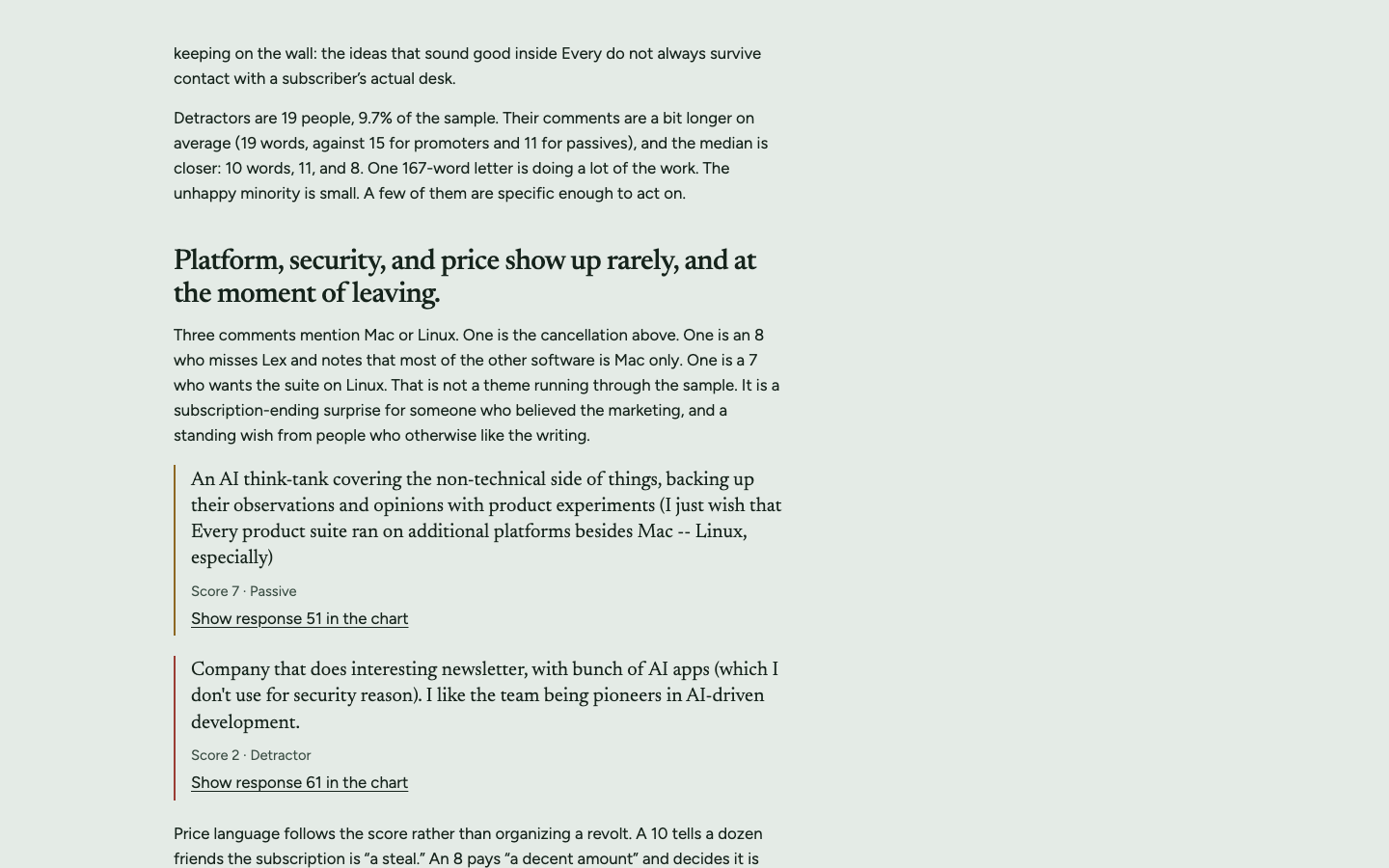
The insights name patterns in the comments, such as promoters praising only the writing, the apps being a promise many subscribers haven't tried, and the company's pivot away from pure writing reading as a love story to some and a breakup to others; none of these could be read off the score distribution.
▸Rubric
Decision-useful insight. Read the insights section(s) of the dashboard. FAIL if every stated insight is arithmetic restated — counts, percentages, averages, or "X% are promoters" phrased as a finding — with nothing that would help someone decide. The bar, in the reviewer's words: "would this actually be useful for me if I was ... making a decision about whether Every is a good product or not." PASS if at least one insight names a pattern in the comments (a theme, a segment, a tension between what promoters and detractors say) that a reader could act on and that is not derivable from the score distribution alone.
Q4Key facts firstthis task
Judge's reasoning
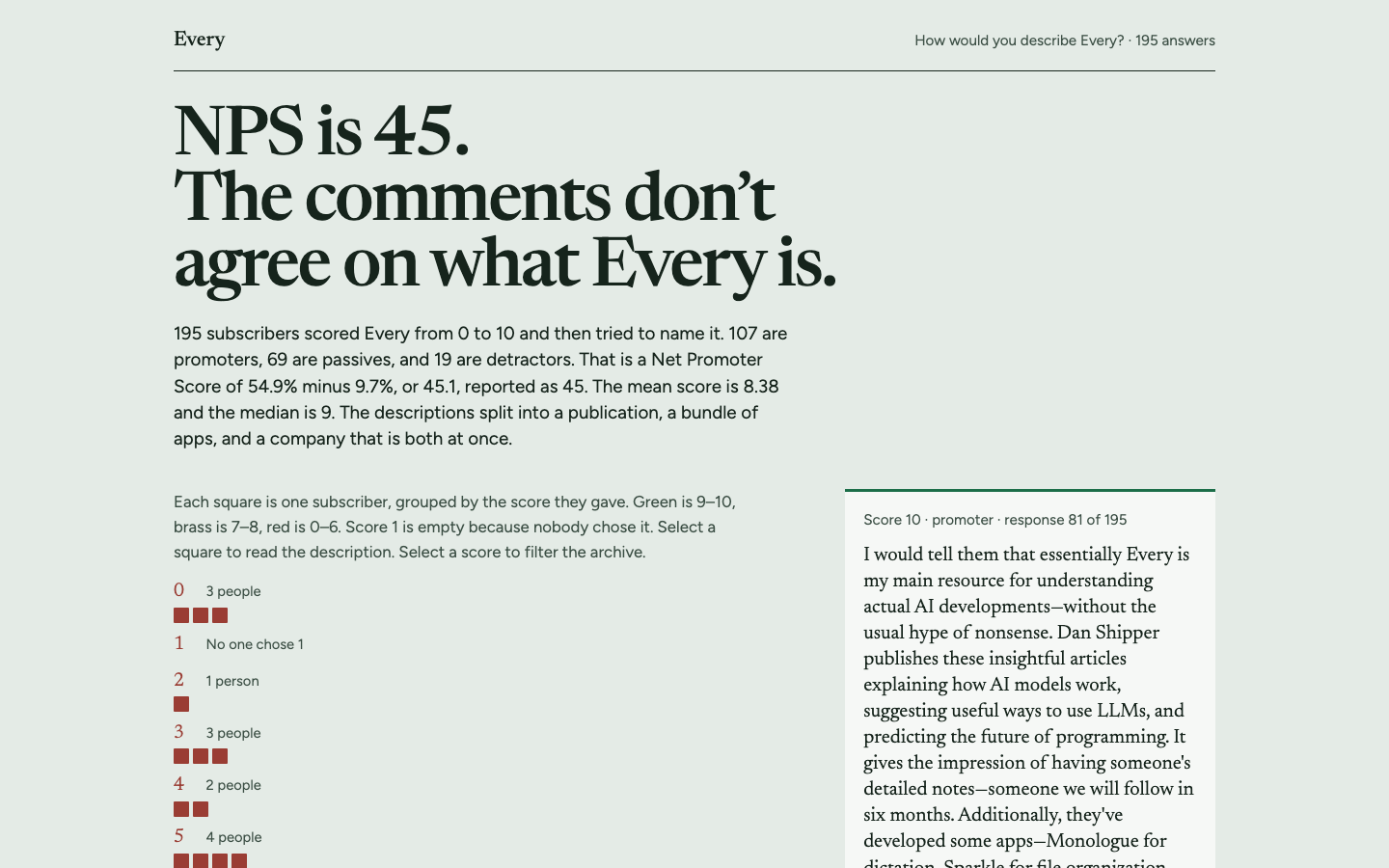
Above the fold, the headline shows NPS 45 and the text directly under it gives 107 promoters, 69 passives and 19 detractors.
▸Rubric
Key information above the fold. Look at `fold.png` only. FAIL if the headline NPS number and the promoter/passive/detractor breakdown are not both visible without scrolling. The reviewer's words: "does it, does it like put the important information above the fold? ... That's the main thing for me."
Q5Useful headlinethis task
Judge's reasoning
The headline 'NPS is 45. The comments don't agree on what Every is.' says something specific and true about this survey, backed by the page's writing/apps/both split, and it makes you want to read on.
▸Rubric
The headline earns its place. Look at `fold.png` and read the dashboard's own top-level title/headline — the line the page leads with, not the browser tab title and not a section heading. This asks two things of one line, and FAILs if either is missing. It must (a) say what this particular data showed, and (b) be worth reading. FAIL if the headline is a bare label that would sit unchanged on any NPS dashboard for any product — "NPS Dashboard", "Every NPS Results", "Customer Feedback Analysis", "Survey Results Overview" — or if it is a naked metric restated as a title. FAIL also if it reaches for interest at the cost of accuracy: a claim the data on the page does not support. PASS if someone who read only that line would learn something true and specific about this survey, and would want to look at the rest. The reviewer's words: *"is the headline a good concise summary of the content while being interesting?"*
Notes
1Harness: Cursor CLI 2026.09.15-d2fe57e with model grok-4.7-high (Cursor reports it as Grok 4.7 256K High). It was uploaded as harness 'grok' only because Every Checks has no cursor harness yet. It is not the Grok CLI. Cursor's sandbox cannot keep the model from reading local files, and the owner explicitly waived that for this run. The runner is the Every Checks export with ec-bench's Cursor adapter (16dba0b) ported in. The judge was claude-opus-5. The agent hit this case's 10m time limit and was stopped. Scoring used whatever it had written by then.
22 Sep 2026